Enhancing Visilant Eye Tester: Johns Hopkins spinoff boosts app security & scalability
We’re proud to share our collaboration with Visilant, a game-changing telemedicine company focused on tackling blindness. We were introduced to Visilant through our esteemed partners at Johns Hopkins University‘s FastForwardU accelerator program. Visilant’s dedication and innovation are evident, as they secured the Summer MedTech Award during the program. Explore the details and successes of our work together.
The Visilant project
A medical technology product harnesses the power of technology in order to improve patients’ lives and overall well-being. One such cutting-edge initiative is Visilant, a technology-based app designed with a goal-centric approach. It guides users through a straightforward eye examination, providing essential eye care to those who might otherwise lack access.
“At Visilant, we strive to enable equitable access to eye care using telemedicine and artificial intelligence. Our intelligent telemedicine platform is designed to reach patients in the last mile and integrate them into the eye care system so that no patient has to experience vision loss or blindness from preventable causes.”
Source
In places where there is a lack of access to eyecare specialists, Visilant’s platform is used to screen individuals for the leading causes of blindness and restore vision to people. Currently, the project consists of two segments:
- An eye-scanner tool: This app allows you to take a high-resolution photo of the patient’s eyes with a basic medical history and send it to the eye doctor for a diagnosis.
- A visual acuity tool: By using this tool, you can perform an eye test with your smartphone to quantify vision loss and inform eye diagnosis.
Overall, this is a tool package with two different applications.
Our team developed a clinically functional visual acuity tool, encompassing both the UX and UI design elements. For the eye screener, we revamped the backend architecture, ensuring it can seamlessly support large-scale deployments within expansive healthcare environments.
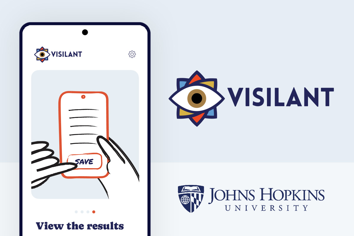
The Eye Tester application
This app offers simple, real-time eye testing. To use this service, the user only needs a phone and Wi-Fi access. Accordingly, from the perspective of user experience, the application should clearly guide the user through the eye exam. To reach this goal, we need some points to help users on this road.
The main points of this concept are:
- Education: The way you can use this testing method
- Testing flow: The main functionality
- Results: They should be easy to save and understand
The app needs an intuitive interface for users with low technical literacy, and a goal-oriented user-flow that enables the user to focus on the key task, the eye screening process itself.
Brand, flow, and interface
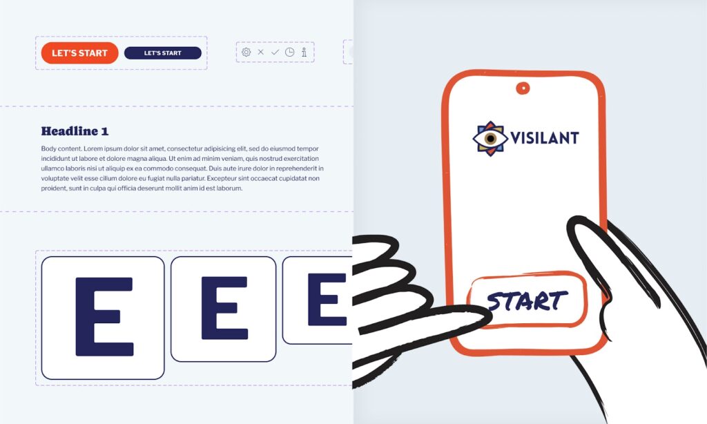
Branding and UI elements and components made by bene : studio
In today’s market, there’s a prevailing demand for goal-driven applications with clear, user-friendly interfaces. Take our eye test platform as an example. It isn’t crafted for professionals but for dedicated volunteers eager to assist others.
From a product and UX standpoint, the main challenge is to ensure a smooth and intuitive flow, minimizing unnecessary steps and clicks. Our design nudges users towards the pivotal actions of the eye test, letting them zero in on providing vision care.
If you have a similar project and need similar solutions, we can help you, too!
What does “clean” mean?
- A barrier-free UX flow without super-user-based configurations or crossroads
- A lightweight yet calm interface displaying only the most crucial information
What does “easy to understand” mean?
- Relevant information seamlessly integrated between the goal-focused flow elements for the current functions
- Clear descriptions accompanied by illustrated elements for enhanced understanding
As you can see, the objective is to develop a clean, comfortable, and informative application with a hint of customization. Sounds simple, right? Not always. While creating comfortable and stylish interfaces is achievable, maintaining focus on the main goal is essential. In this context, we aspire to design a sophisticated interface shrouded in simplicity.
Users have three primary objectives:
- Efficient onboarding: A brief, clear introduction that outlines the complete process and highlights essential tasks to conduct the test accurately.
- Test-centric interface: An easy-to-access feature that enables testers to initiate the eye test without any additional knowledge or functionality.
- Accessible secondary info: A straightforward section for users to view optional details, revisit the onboarding, and adjust certain test settings.

The UX flow within an onboarding animation, made by bene : studio
What we made based on these needs:
- Branding: We need a brand identity for this app. We made it based on the available logo. It contains colors, typography rules, and some other extra elements (like logo animation).
- UX concept: We made a clean user-flow concept according to the above reasons, which includes the onboarding process, the testing functions, and the informational and settings screens.
- UI design: After that, we created the UI screens and components for the application.
- Development: Developing the application.
Development
We split the project into different parts because each had its own purpose. Because of this, the project was implemented in React Native. This provides the opportunity for the client to experiment with newer technologies.
Generally, we use industry-standard libraries and frameworks in the project and opted to use Expo since it is the build framework recommended by the React Native developer team. We also developed a small backend to support the application’s functionality and decided on using Nest JS because it provides structure and organisation to the codebase.
Both the main part of the app and the background system use the latest tech. This means we don’t have old or outdated stuff slowing us down. This technological combination gives an excellent solution for a wide range of functional needs and product goals.
The result
“Working with bene : studio has been excellent! They assembled an amazing team of experts in multiple disciplines dedicated to scaling our MedTech software platform. Their team is always very thoughtful in communicating about and prioritizing our business needs. I always feel confident they will deliver a high-quality product quickly. They were willing to work within our budget and timeline constraints to find an arrangement that suited our organization’s needs.”
Jordan Shuff, Co-founder of Visilant
With a simple flow, we’ve presented a theory centered on primary functions. When you open the application, you’ll immediately see onboarding information and can start the test. That’s the entirety of it. Every UI element was designed with this straightforward structure in mind, omitting extraneous fields and elements that might distract.
From this viewpoint, the healthcare sector isn’t much different from other market segments. There are diverse UX and UI demands based on product specifics. At times, we require extensive, screen-rich applications with intricate customization paths. Other times, a streamlined flow with minimal steps suffices. Meeting market and user demands means zeroing in on the right objectives and understanding user preferences.
If you have similar questions or need help with your own project, feel free to ask us. Our developers and designers are ready to help you!