An in-depth look at nucleusRx’s website and app UI/UX
Introduction
As part of the M2D2’s IMPACT accelerator program, bene : studio offered complimentary audits to innovative medical device companies. These evaluations are centered around identifying enhancements in UX/UI and development aspects of the apps. We’ve put together a checklist that highlights both the strengths and areas for improvement in these products. In case the product owners need assistance, we are equipped to facilitate these enhancements.
Now, let’s delve into one of these audits, specifically conducted for nucleusRx!
About nucleusRx
nucleusRx offers a personalized patient care solution, building a virtual care system that equips healthcare providers with the necessary tools for real-time patient monitoring and proactive remote interventions.
Their team consists of accomplished technologists, clinical leaders, and healthcare entrepreneurs with experience in creating and scaling innovative platform solutions. Their vision is to improve the quality of life of patients by delivering personalized care at home and improving outcomes while reducing healthcare costs.
nucleusRx is an online platform that encompasses both a developmental aspect and a user interface. Additionally, it has a separate website dedicated to showcasing its features and capabilities. Our objective is to conduct a thorough UX/UI review of these components.
The aim of our investigation was to enhance the product’s alignment with its future objectives and to elevate the overall user experience. To achieve this, we compiled a list of evaluative points and suggestions.
The review
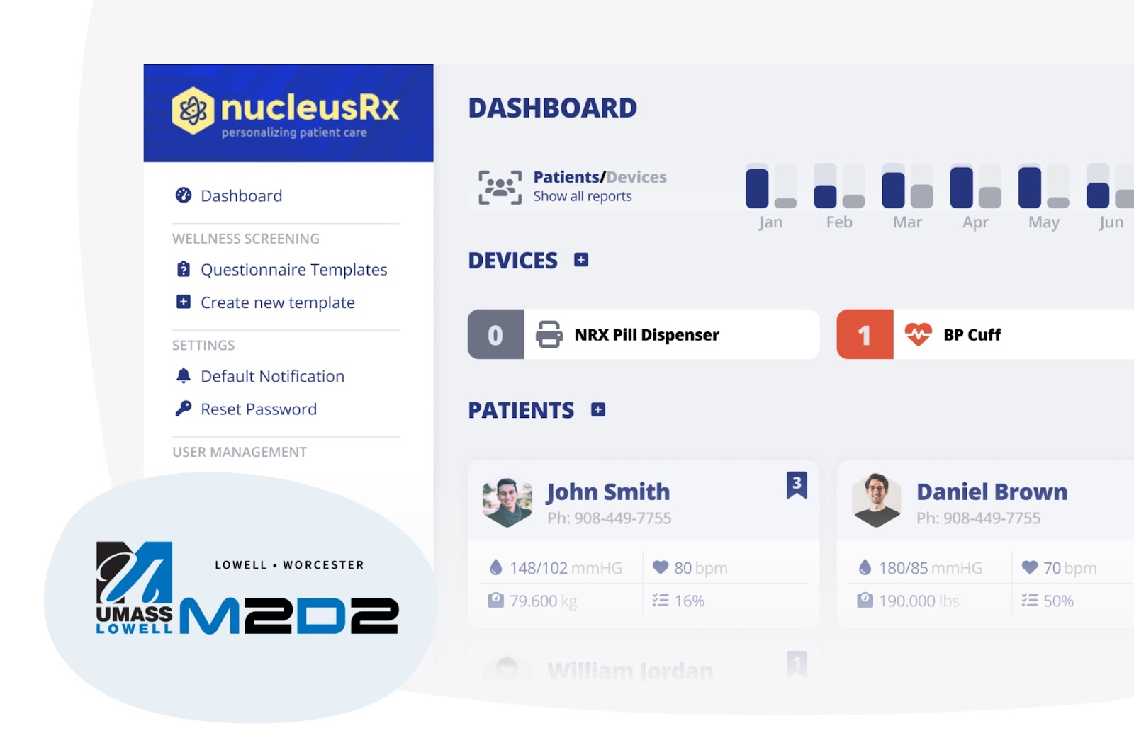
Throughout our review, we meticulously gathered information about the existing features of the nucleusRx app and website. Based on these findings, we formulated a set of proposals aimed at enhancing the user experience and simplifying navigation for both casual visitors and regular users. Our recommendations were specifically tailored to align with the current user interfaces of nucleusRx. Below, we present the current screens as part of our analysis:
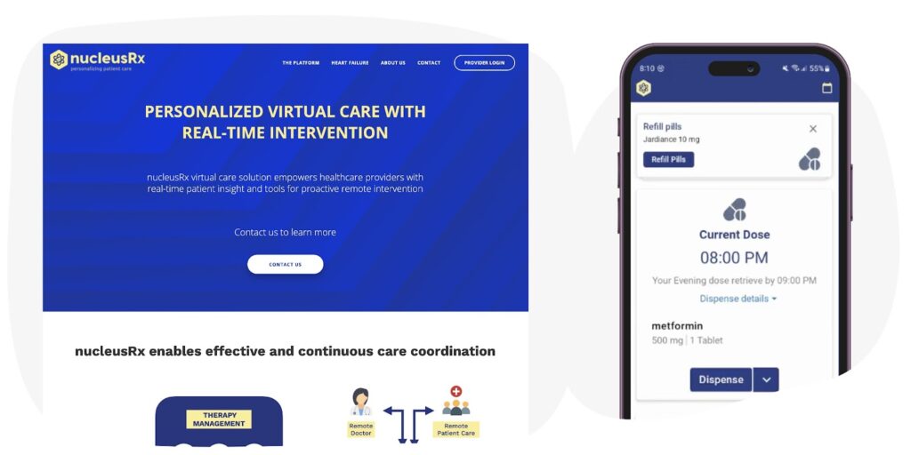
nucleusRx’s current web and app design
Additionally, in our meeting with the client, we discussed their future aspirations for the product, current observations, and specific areas they wish to enhance. Our approach is to recommend changes only where we see tangible benefits or necessity. We are not aiming to completely overhaul the application unless it’s essential. Our proposals were crafted with this philosophy in mind, ensuring that they align with the client’s vision and the product’s core objectives.
Our proposals
In the course of our review, we identified a range of advantages and disadvantages associated with the current state of the product. Based on these insights, we developed suggestions for further development and outlined potential steps for their implementation.
Additionally, as part of our comprehensive proposal, we also prepared surface plans. This thorough analysis forms the foundation upon which we base our implementation proposals.
Pros:
- Clean and updateable interface and design
- Comprehensive information on the website
- Brand elements are well-integrated
Cons:
- Lack of app imagery or usage-flow demonstrations
- Some UI and UX methods require refinement
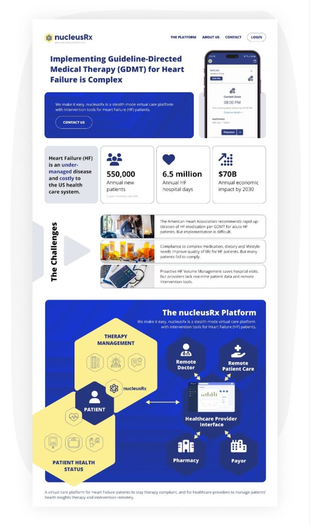
UX/UI concept for nucleusRx landing page. Made by bene : studio
Drawing from the previously mentioned points, we’ve formulated specific goals and the means to achieve them:
- Utilize more space, flacks, and grouped information: This approach aids visitors and potential users in assimilating more information quickly. Including screenshots from the product will enhance visibility and understanding
- Focus on functionality in design: Different features require distinct structures. Designing UX flows and UI screens with a focus on specific functionalities will lead to better comprehension and usability
- Incorporate brand-based elements: Utilizing brand elements consistently across the website and app reinforces brand recognition. Unique features like graphs, flowcharts, and listings should be designed to associate closely with the brand identity
- Regular updates to UX and UI: Considering the points above, periodic updates to the web design, and the app’s UI and UX flows are recommended to stay current and effective
Summarizing the value these changes will add to the product:
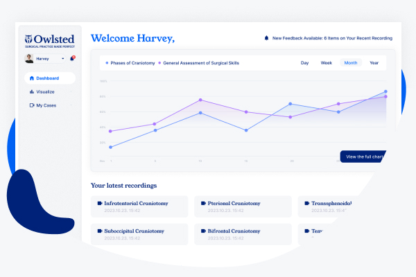
- A more informative and widget-enhanced dashboard
- An increased focus on gesture-oriented blocks
- Improved onboarding and onsite information
As part of our proposal, we also prepared plans for the application and web interface based on the points listed and the UX/UI principles that support the goals.
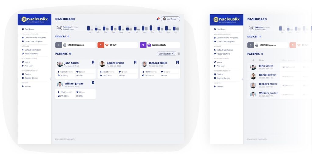
UX/UI concept for nucleusRx dashboard (card view and list view). Made by bene : studio
Conclusion
In light of our suggestions, we have compiled a comprehensive list for the client, outlining a strategic roadmap for effective implementation. This list serves as a practical guide for enhancing the product’s interface, ensuring that the proposed goals are achieved efficiently and effectively. Moreover, should the need arise, our skilled team of UX/UI designers, project managers, and developers stand ready to offer hands-on assistance in the implementation process. We can not only provide insights but also facilitate the actualization of these improvements.
If we can help you the same way with your product, feel free to contact us!