Creating light and dark themes with Figma Variables
Creating both dark and light modes for both web and mobile apps has slowly become crucial. As personalization becomes more important in digital interactions, having these modes goes beyond looks and adjusts to various situations where users use the app. Let’s explore Figma’s Variables feature together, which completely changed the design game: designers can now easily create and customize dark and light modes. In this blog post, we’ll explore Figma’s Variables feature and its role in shaping the future of web design.
Why is it important to offer Light ☀️ and Dark 🌙 modes?
- Accessibility and inclusivity: Dark mode can be easier on the eyes, especially in low-light environments, and for users with light sensitivity or visual impairments. By providing a dark mode option, you make your application more accessible and inclusive to a wider range of users.
- Reduced eye strain and fatigue: Dark mode reduces the amount of blue light emitted by screens, which can lead to reduced eye strain and fatigue during extended usage. This can improve user comfort and encourage longer engagement with your application.
- Battery conservation (for OLED screens): Dark mode can be particularly beneficial for devices with OLED screens. OLED displays can turn off individual pixels in dark areas, leading to potential energy savings and extended battery life for users.
- Aesthetic preferences: Different users have different aesthetic preferences. By offering both dark and light modes, you cater to a wider range of design tastes, increasing user satisfaction and engagement.
- Brand customization: Light and dark modes can also be used to reflect your brand’s identity. You can design both modes to align with your brand’s color scheme and style, creating a consistent and recognizable user experience.
- Contextual adaptation: Some users might prefer dark mode for nighttime or dimly lit environments, while others might prefer light mode during the day. By providing both options, your application can adapt to the user’s context and enhance usability.
- User choice and control: Allowing users to switch between light and dark modes gives them a sense of control over their experience. Users appreciate when an application respects their preferences and offers customization options.
- Competitive advantage: Offering a well-implemented dark mode can set your web application apart from competitors. It can be a unique selling point that attracts users who prioritize comfort and customization in their digital experiences.
- Compliance with standards: Some industries or regions might have accessibility standards that recommend or require the implementation of dark mode for improved readability and inclusivity.
- Future-proofing: As dark mode becomes more prevalent and expected across digital platforms, having this feature in your web application positions you to meet user expectations and stay current with design trends.
- Developing both dark and light modes for a web application demonstrates your commitment to user experience, inclusivity, and customization. It addresses various user needs and preferences, leading to increased user satisfaction, engagement, and potentially a competitive advantage.
Let’s do it with Figma! 🖥️
Until the middle of 2023, it wasn’t so easy for designers to create both light and dark modes for a specific web application. Luckily, Figma introduced the Variables feature this year, which provides solutions to problems that designers have longed for.
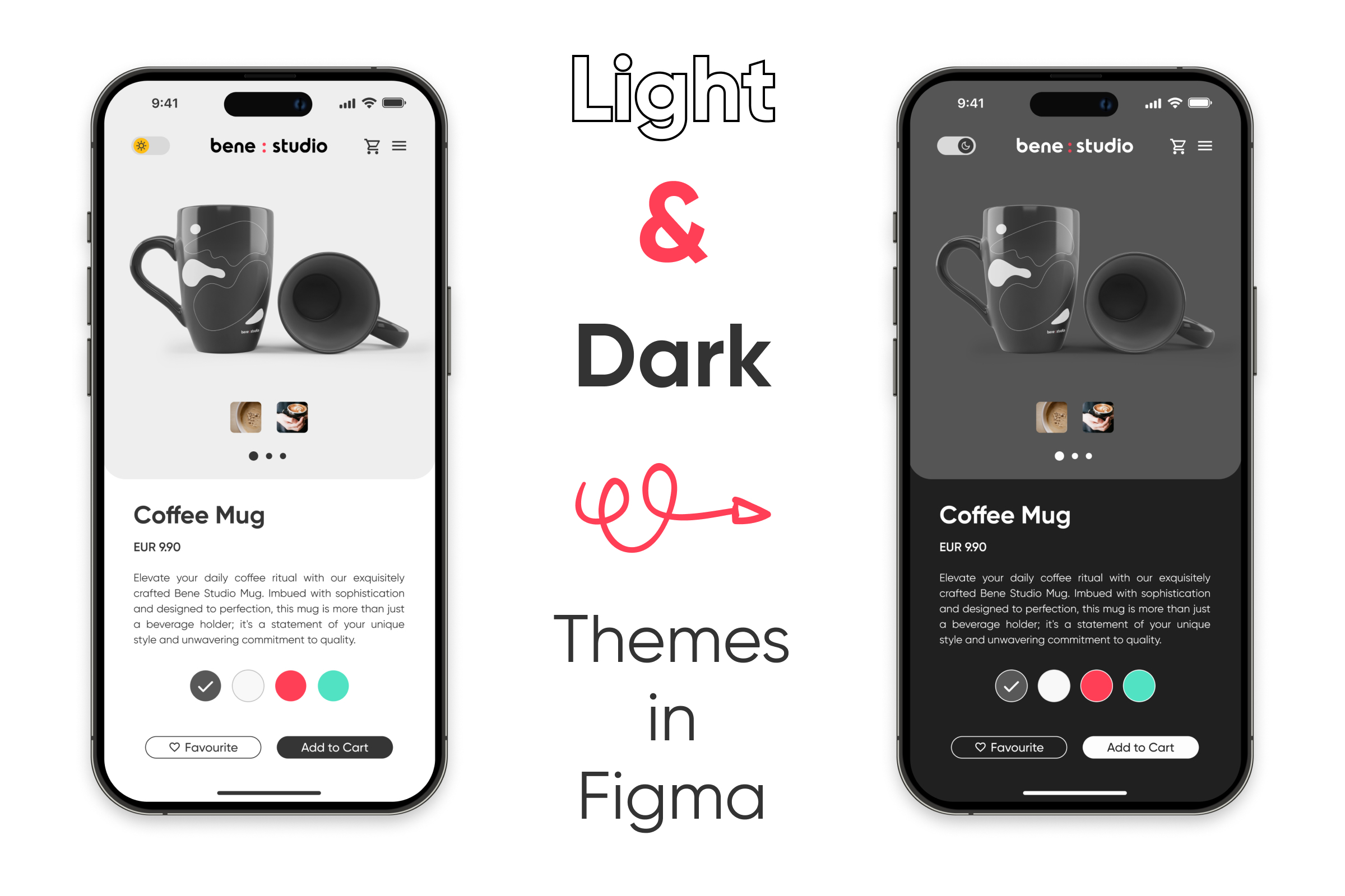
I’ve designed an imaginary webshop and a product page for bene : studio’s mug to showcase the workflow of this new feature. Let me demonstrate how I implemented light and dark modes in Figma following this update.
To start, I crafted the layout for the light mode of the product page. Following that, I developed the color palettes for both the light and dark versions:


In the meantime, I started to think ahead and created light and dark versions for the company logo, as well as a toggle that users can switch between the two modes:

The next step is to create Local Variables and define the color pairs for both the Light and Dark versions. Once this is accomplished, the result is as follows within Figma:

The logo and toggle-switch are also incorporated here, as they need to change according to the layout. Within Figma’s Variables feature, users can add color, number, string, or boolean variables. For the logo and toggle-switch, I used the boolean variable option with a simple true or false command, as indicated in the final four lines of the screenshot above.
Once all the elements are in place, you’ll be able to set a theme (light or dark) for a frame, section, or layer. This means if you drag and drop your prepared layout into this designated area, it will adjust accordingly based on the setting of the layer.


To switch between light and dark mode, simply click the arrows located at the bottom.
Summary
Offering these themes with the help of Figma enhances user experience, accessibility, and customization. Dark mode, particularly beneficial in low-light environments, alleviates eye strain and fatigue, and can even extend battery life on OLED screens. It caters to diverse aesthetic preferences, mirrors brand identity, adjusts to user context, and empowers users with choice and control. The integration of dark mode can confer a competitive edge, ensure compliance with standards, and future-proof the application.
From a designers’ perspective, Figma presents a great tool that not only streamlines the process but also enhances precision when creating light and dark modes for our clients in the future.