How to improve UK’s most popular app by NHS
As a digital product consultancy, bene : studio has always been interested in examining systems and applications and finding ways to improve them.
The team at bene : studio is not only curious about improving systems and applications but loves sharing knowledge and therefore has made the findings of some of the product audits public to support the HealthTech community, as the studio becomes more and more involved within this industry. Product audit is a core service of bene : studio. It serves as a foundation to support the product planning, design, and development services for a client.
In this article you will read the outcomes of a Product audit we’ve delivered for Healthwave as a part of their project.
About National Health Service

The National Health Service is the publicly funded healthcare system in England, and one of the four National Health Service systems in the United Kingdom. It is the second-largest single-payer healthcare system in the world after the Brazilian healthcare system.
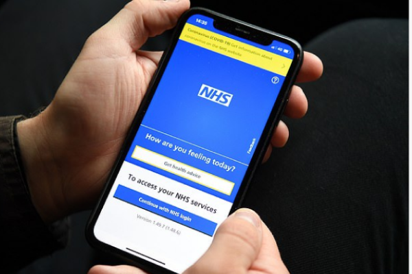
Bene : studio got involved in a project to review information accessibility and login flows on the NHS app. The app is installed on 10 million+ mobile phones, making it especially important to make it work.
What you will read about
We highlighted a few aspects which could help you improve some of the most important functions on the NHS app: the login and search flows, which make the information more accessible and the app more user-friendly.
- Login and registration flows and behaviors;
- Search patterns and information accessibility.
The login and registration flow are crucial to an app: after all, they are the first impression of the product on the user’s mind. This is why this process should be as simple as possible, requiring a few steps and screens to be completed. Both flows should be separated between new and returning users because the information needed for both cases is very different.
Login and registration flow
This audit summarizes our impressions while checking the product. It enlists and weighs the issues found, and provides suggestions to solve them.
During the audit, we tested one user flow: the one which adds the user to the waiting list. We perform testing by running through a flow multiple times, enabling us to check the same screens with different inputs, exclude issues that we falsely identified an issue the first time, and let us learn the app better.
Login in the NHS app
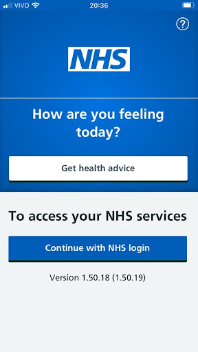
The first screen of the app, divided in half vertically, can be misleading. Having two different background colors for each half results in an unbalanced hierarchy.
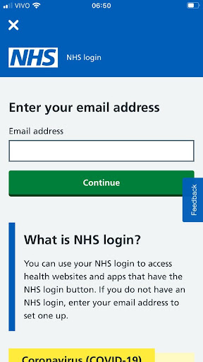
The app uses a system that identifies if the user is registered or not using the user’s email. Usually, the users are offered two options: login or register. That way, they know beforehand which path they’re headed.
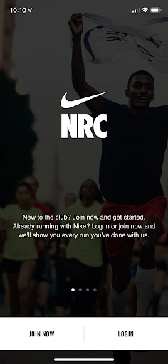
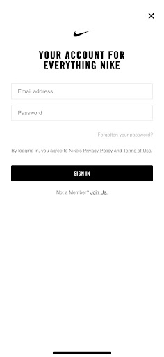
We can take a look at Nike’s app onboarding screen as a reference. The first screen is very simple and direct, with one button for registered users and one for new users. If you decide to log in, the next screen asks for all the necessary info on the same page.
Excited about visual hierarchy? We have these two articles examining it in more depth:
Making information accessible
One of the challenges of a public service app is the quantity of information that needs to be shown. Usually, there are a lot of mandatory texts in apps that deal with public health, especially in an app that is expected to be used by a broad audience, including people with older devices and elderly people that may be less tech-savvy.
All that information must be easily accessible, but without interfering with the ideal flow of the app. When we talk about a health app, it should also be noted that it could be used in emergency situations, or when the user is sick, with pain, etc. All of these conditions should guide the user flow to be leaner, with fewer buttons needed to be tapped to get to the information they’re looking for.
Login interrupted
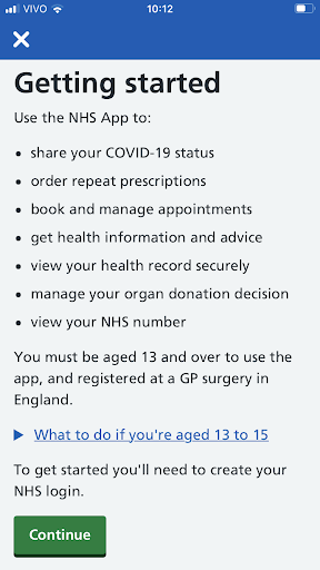
As soon as the users tap on the login button, they arrive at this screen, which presents the main functions of the app but also interrupts the login process. This kind of information is very relevant but could be presented in a different way.
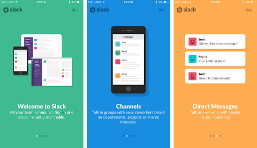
One solution to this is to have onboarding screens: they appear the first time the user opens the app, showing the main functionalities in a simple and easy way, like a slide presentation. In this example, we take a look at Slack’s onboarding, which uses short sentences and illustrations to present its app.
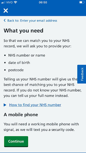
After the user fills their email, there’s a list of required documents and conditions that interrupts the login flow again, when that information could be accessible in a less disrupting way. It’s very important to have detailed information about user data and documentation, especially on a public service app, but this information could be structured in a way that wouldn’t add more screens or steps to the login process.
Searching for health advice
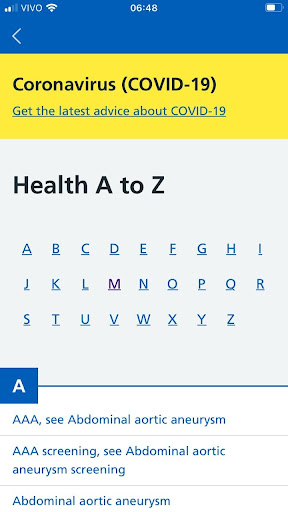
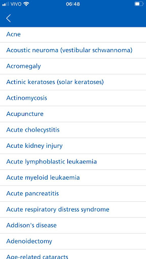
A search flow should always be easy to use and accurate. The current solution for health advice is very hard to use, because of the high quantity of searchable items. After tapping on the first letter of a health condition, the user has to scroll through a huge list to find what they’re looking for. A search box is a simple and very effective solution.
Since the app offers the possibility of searching for health advice without having to register as a user, this option could be available directly from the first screen, in order to accelerate the process.
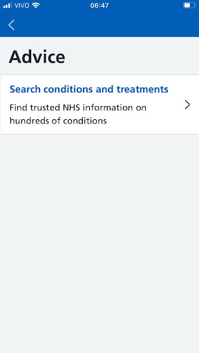
Tapping on “Get Health Advice” takes the user to a list of menu options that only have one option available. Since there’s no other action possible other than going forward to the search, this screen could be omitted. It’s important that the user gets to the information within the fewest steps possible.
It’s a good idea to divide the health conditions into an “A to Z” menu, but since there are so many items on the list, it’s hard to find what you’re looking for. a search box for keywords would greatly improve the process.
A search box could be used directly from the first screen, where the user would input their symptom/condition and be redirected to the respective page, without having to pass through other pages in the process. That way, the search is way more useful and easier to reach.
Summary of the analysis
In this article, we looked at a public service health app used by millions in the UK. An app of this kind naturally has a huge amount of content which makes information accessibility extremely important. We have shown ways to improve it with a search bar for example and we have also proposed industry best practices to implement in the login and registration flow.
Key take-aways:
- Orient the user by using solutions they are already used to
- Use onboarding process for first time users
- Help the users with a search box when there are a lot of items to browse
We would love to look at your digital product!
We help our clients develop their products, starting with a product audit. With the experience of more than 100 projects, we look at the values of a product and key areas to improve within the application, software, UX, design, or user flow.
- We help you find the best solutions for your challenges
- We share our experience with 100+ projects behind our backs
- We can support you with the execution as well