Using visual hierarchy in an EHR app crowded with data
You are now reading a blog post that is a result of a product audit delivered to one of our clients, Wellsheet. Product audit is a core service of bene : studio. It serves as a foundation to support the product planning, design, and development services for a client.
As a digital product consultancy, bene : studio has always been interested in examining systems and applications and finding ways to improve them.
The team at bene : studio is not only curious about improving systems and applications but loves sharing knowledge and therefore has made the findings of some of the product audits public to support the HealthTech community as the studio becomes more and more involved within this industry.
Introduction to Wellsheet

Wellsheet changes the electronic health record experience by using machine learning to create a predictive clinical workflow platform that allows physicians to view information that is contextualized and prioritized for their specific needs.
Their platform is accessible from anywhere. You can access the full Wellsheet functionality directly within the EHR system, or from a phone or tablet, so you can have the data you need anywhere and at any time.
They offer Handoff and Smart Alerts to address bottlenecks in care by notifying users as new data hits the chart, identifies barriers to discharge and provide team-based care coordination. Their product includes automated risk calculators and a net promoter score system as well, but in this audit, we focus on their Clinical Views.
Clinical Views is a visual problem-based charting. It is supposed to surface the most relevant problems, medication suggestions, and preventive analytics with a personalized summary.
Wellsheet’s Clinical Views concept
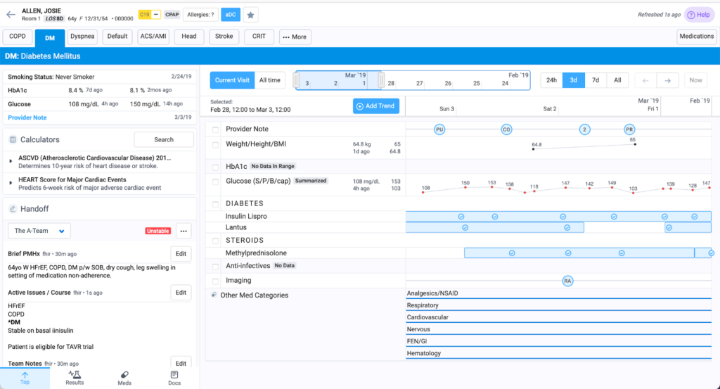
When you look at the interface you see a lot of information, but you cannot decipher what is important right?
Although the product wants to showcase important data, it is not very apparent due to the lack of visual hierarchy.
Let’s take a look at our suggestions on how we would change the design to handle all this crucial data in one space.
Visual hierarchy
Our goal is to decrease burnout by making it easier to see and handle all the available confined space. This is a difficult design challenge, where the first step should be to create an information architecture that will help to define the visual hierarchy.
Visual hierarchy helps the user to be able to navigate easily and naturally. Adjusting different design features from colors to font-weight to add more emphasis on priority items provides good guidance for scanning the information.
Investigating what is the most important piece of information that must be easily found should be the starting point. For example, if a user wants to find something related to “Handoff” what will they look for? Are they looking for the phrase of handoff, or will they search for something else? Clarifying these questions in the information architecture could help a lot to make sure that the users will find it easy to use.
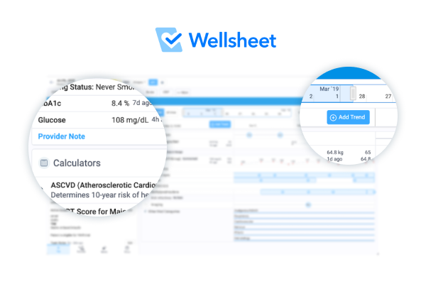
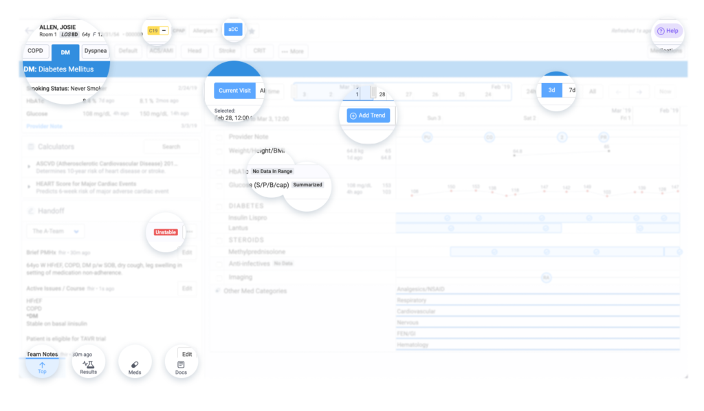
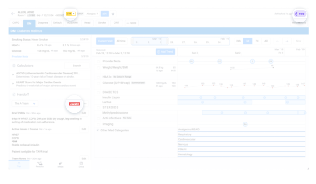
These are the areas that are currently stand out the most during a scan reading.
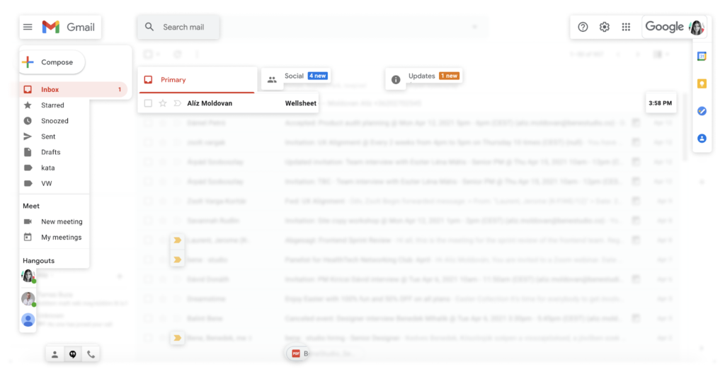
A good example we would recommend to look at is Gmail. It is a similar products that displays a lot of information, but it does a really good job in highlighting the items that lead the users to places where they find what they’re looking for.
The tools to implement visual hierarchy
Let’s take a look at them one by one.
1. Typography (size, weight)
When it comes to typography we would recommend modifying emphases on the headers.
Adding more emphasis to the headers helps the user to find what they are looking for immediately. People usually scan reading a screen when they’re looking for something. It means that our eye scans the screen, and it’ll stop for a second where it finds more contrast. The users are not dealing with all the provided information at one time. They have to choose the section first, and by then, they’ll be “blind” to the details.
Staying with the previous example, if you want the user to find something related to Handoff, it’s better to highlight the header instead of the content’s details.
You’ll read
And only after you’ll read the descriptions.
You are probably not going to read the smallest text immediately, especially if they are longer as well. You’ll only read this smaller paragraph text when you have already read the bigger text. When you have to show a lot of information, it’s better to organize it below headers and topics. This was an example of how to use visual hierarchy. Of course, you can also highlight information here as well, so it’ll stand out earlier.
the headers first
And only after you’ll read the descriptions
This will be the last one you’ll read, but we’d suggest skipping it for now as it’s the same text as on the left. You are probably not going to read the smallest text immediately, especially if they are longer as well. You’ll only read this smaller paragraph text when you have already read the bigger text. When you have to show a lot of information, it’s better to organize it below headers and topics. This was an example of how to use visual hierarchy.
2. Colors
Use colors to highlight the most important parts!
Wellsheet has already done well in recognizing that when you have to show a lot of information, it’s better to keep it as simple as it’s possible in terms of colors. The monochromatic design helps a lot to keep it clear and to avoid visual mess.
However, in this case, different colors can stand out even more. So make sure that you are choosing wisely where you use different colors. Currently, the areas highlighted with colors are “C19”, “Unstable”, and “Help” on the screen. Make sure that these are the ones that should stand out anytime for the user.
1. Red has the strongest contrast, so that one stands out the most.
2. Yellow also stands out, but as it has less contrast with white.
3. The third one is purple as it’s similar to the main color.
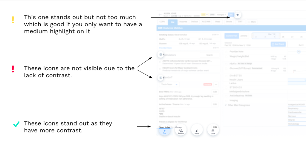
3. Icons
Icons are useful to attract attention. You might have already recognized in the previous screens, icons are usually in the most prominent areas. As they look different from text, they attract attention with their shape and contrast.
Icons can be used as highlighters (with text) or as compactors (standalone). Standalone icons have hidden functionalities, so it should not take much time to learn about these functionalities.
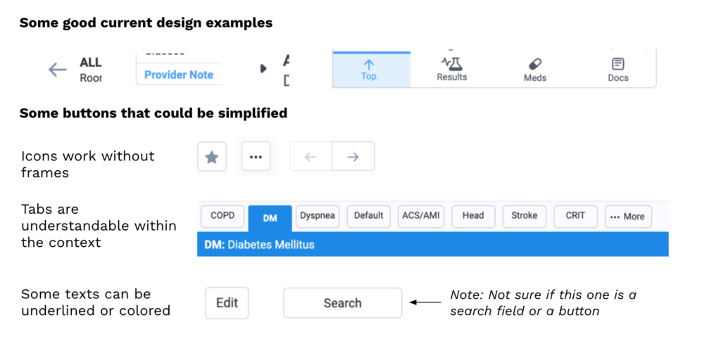
Icons don’t have to be surrounded by frames. If you use standalone icons without text, the users, in most cases, have the collective knowledge that these are CTAs.
4. Information grouping
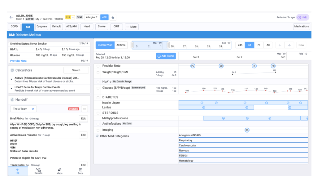
Sectioning the information makes noisy screens more understandable. At this point, Wellsheet already has sections in their design which is a good approach. Despite that, it’s hard to recognize them. The contrast would be the key here as well. Making the background gray darker would help a lot for the sections to stand out. Also, as the left section has a title, it would be good to have a header for the rest as well. Currently, it’s not completely clear if the header of the right part is the “Diabetes Mellitus” or it has no header at all. Only the necessary information has to be shown at one time. The sections can be collapsible, so if there is some information that can be hidden, we’d recommend this simplification.
Highlighting the headers and darkening the background would be a quick-win solution here.
It’s an example of how to make the sections stand out more. You can use different tools as well, like spacing, darker strokes.
The most important is grouping information based on the information architecture to make sure you make it easily accessible.
+1 CTAs and clickable options
Although consistency is key in design, we can have variations of CTAs. Currently, all the clickable parts in the design have (almost) the same appearance. There are primary and secondary buttons, which are good, but simply looking at the number of clickable items on the interface, we recommend having more variations to represent hierarchy better.
For example, standalone icons already function as CTAs. Dropdown menus should be differentiated from other CTAs. Tabs are understandable due to their context, and colored text also indicates a clickable area. Adding frames to these increases visual noise instead of helping to keep the design consistent.
To summarize, we have seen a brilliant application from Wellsheet, providing lots of important data to its clients. However, they ended up with a lot of information on the screen, just like Facebook or Gmail. We have shown how improving the visual hierarchy within the app could make it easier for users to navigate and find important information. Hope you found this piece useful.
About Product Audits
bene : studio helps clients develop their product strategy starting with a product audit. With the experience of more than 100 projects bene : studio lists the values of a product and key areas to improve within the application, software, UX, design or user flow.
The audit is followed by planning where the client receives a detailed document on how the improvements can be implemented as a part of the digital product strategy.
If your startup or enterprise is interested in product audit or product planning book a free consultation with us.