Help users with better visuals in your HealthTech app
You are now reading a blog post that is a result of a product audit delivered to one of our clients, eCovery. Product audit is a core service of bene : studio. It serves as a foundation to support the product planning, design, and development services for a client.
As a digital product consultancy, bene : studio has always been interested in examining systems and applications and finding ways to improve them.
The team at bene : studio is not only curious about improving systems and applications but loves sharing knowledge and therefore has made the findings of some of the product audits public to support the HealthTech community, as the studio becomes more and more involved within this industry.
Introduction to eCovery

eCovery allows for professional rehabilitation anywhere with the combination of sensor technology, a digital application, and professional medical expertise. Accompanying patients in their recovery journey by allowing for safe, independent rehabilitation and making evaluations for physicians/therapists as easy as possible with live data access.
Goals of this audit
We love design, research, and discovery so we created suggestions and ideas based on our expertise to help make the eCovery app even better.
The app’s main function is to provide its users with physiotherapy and rehabilitation video sessions, so they can keep following their treatment at home. To achieve this, the navigation of the app must be easy to follow, and all the relevant information should be readable. That’s why we’re focusing our audit on two aspects: visual hierarchy and, more specifically, buttons. This way, the information can be more accessible and the app more user-friendly.
What you will read about
- Visual hierarchy: establishing relations between different kinds of data.
- Buttons and their main characteristics.
Visual hierarchy
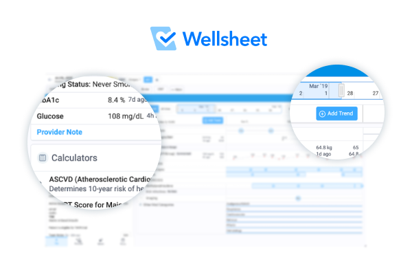
In order to organize and present data in an easy and intuitive way, we must apply visual hierarchy principles, as we discussed in one of our other product audits for Wellsheet. The information elements should be organized in a way that reflects their relative importance, using properties like size, shape, color, and positioning.
When an app has a well-set hierarchy, the eye of the user is guided to the most important information, and they can find what they are looking for in a quick glance.
Text hierarchy
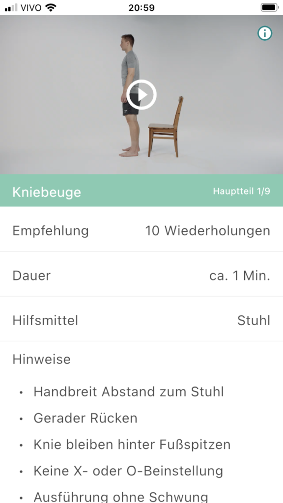
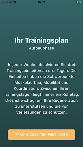
The exercise screen has different information shown with the same text visual properties: color, size, and positioning. That makes it harder to identify the various types of data, and the information required to perform the exercise gets lost in the way. By focusing on a more refined visual hierarchy, we can make this screen easier to read.
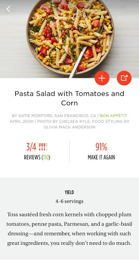
As an example, we take a look at Epicurious, a cooking recipe app. They use typography properties in order to give different importance to the data elements, like color, size, font families, weight, and positioning. They also use background colors and elements like icons and shapes to organize the information.
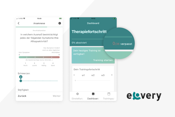
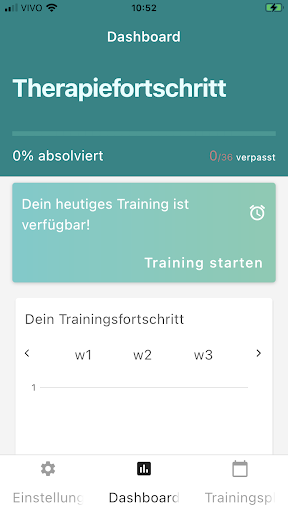
Dashboard screen
In the Dashboard screen, the visual hierarchy is more developed: there are different font sizes and weights, and the background variations of color and width also help to rank the data and give different importance to the elements.
One thing that could be improved is the visibility of the 0/36 verpasst indicator, which should have a different color so it’s more visible.

Buttons
Buttons are one of the most fundamental and important elements for a successful user experience. Being a type of link, buttons serve to take the user to other places in the product or to help accomplish a task. In order to do that, they need to communicate very clearly that they are indeed a button, and what action they perform.
The best way of doing this is by adding visual cues: graphic indications that grab the attention of the user and show that the button is clickable. That can be done in many different ways: adding a shape as a background of the button (that can be outlined or solid), adding auxiliary icons, and experimenting with color. Simple text buttons can also be used, but always in a context where it’s clear that they are actionable.
No matter what option is used, one thing is crucial: buttons should be consistent. Similar actions during similar moments and places on the same app should be visually resembling, so the user creates a memory of what does what, and this way the experience is more fluid. Another important aspect of buttons is their visibility: their size should be relevant to their placement, and preferably they should be always visible, especially if they’re required to continue with ongoing actions.
In the following sections, we will show a couple of examples where the buttons could be improved, in order to better facilitate the use of the app.
Highlighting the buttons
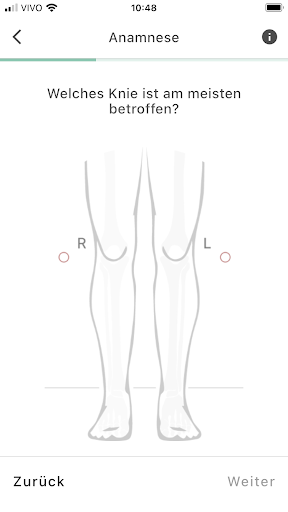
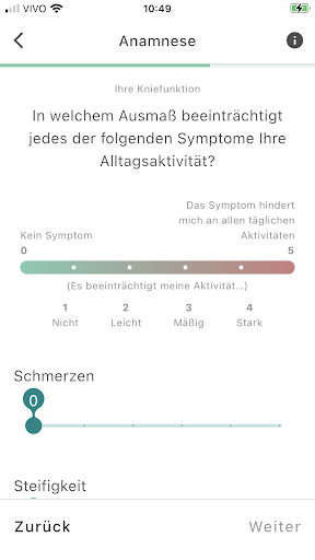
On the Anamnese screens, the navigational buttons are simple text links, with the same font and almost the same visual characteristics as the rest of the text on the screen. That makes them harder to find.
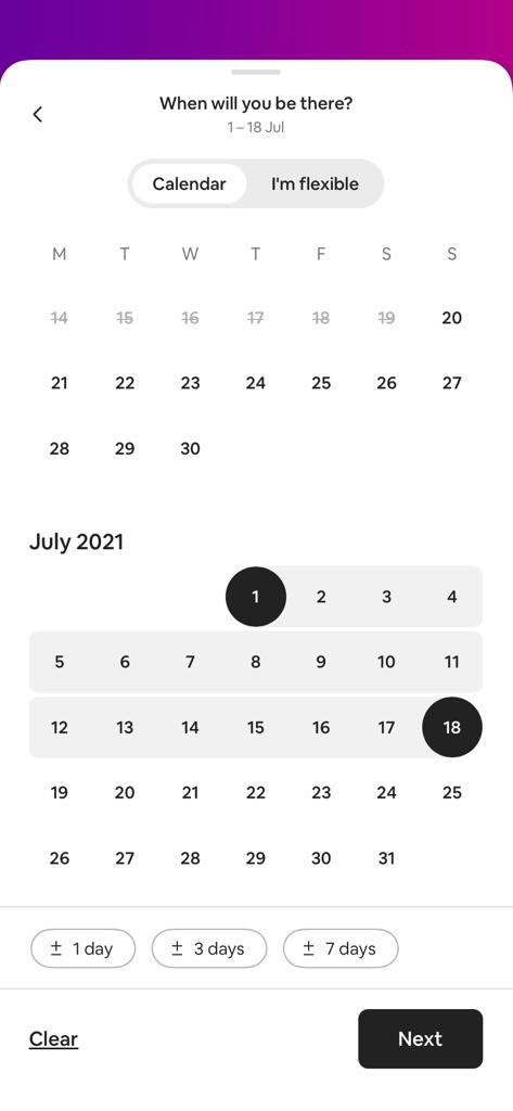
This is how Airbnb tackles this issue: their “Next” button is clearly marked with a background shape, and their “Clear” link – equivalent to Zuruck in this case – is an underlined link. This way, it has less importance than the “Next” button, guiding the user to go forward.
Hidden button
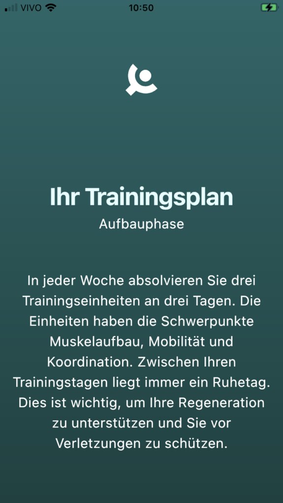
On the introduction to the training schedule, the main button, that sets the schedule and moves the flux forward, is hidden behind the scroll. This happens especially on smaller screens. Since there’s no scroll bar or any other indication that the content is taller than the screen, it makes it hard for the user to move forward.
Button labels hidden
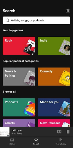
On the main screen, the labels for the three buttons on the bottom navigation bar are not entirely visible, because the words are bigger than the space they occupy. This way, the words are chopped off, and the user can’t read the whole name of the section.
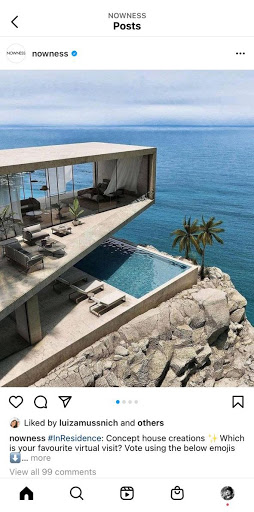
There are two main ways to fix that: use a smaller font (like Spotify does) or, if the icons are clear enough, don’t use labels at all (like the Instagram example on the right)
Position inconsistencies
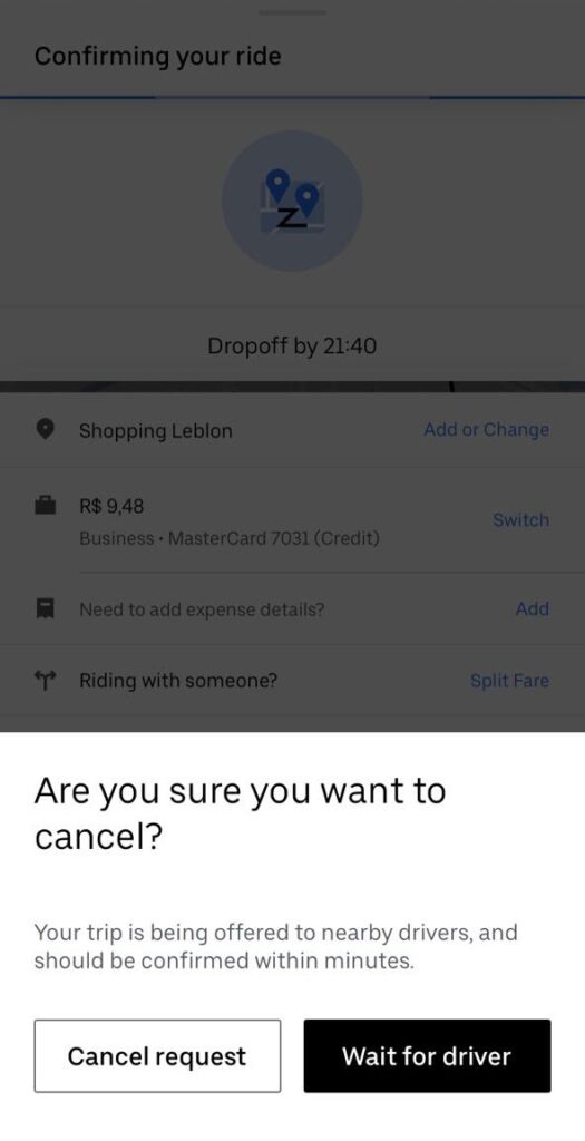
On different pop-up warnings, the action options appear on different layouts: stacked and side by side. They should appear in the same positions as much as possible. Being approval buttons, where you have to choose between interrupting an action or moving forward, they should always be side by side, with the forward option on the right side of the popup.
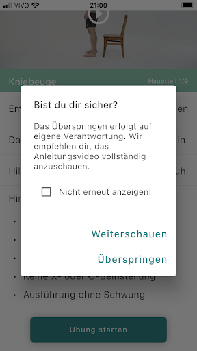
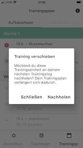
Since these pop-ups are related to the cancel or continue options, you could also use two different weights for the actions, so they have a relation of importance between them. Here’s how Uber presents their options when the user wants to cancel a ride.
Overall we have seen a great rehabilitation application from eCovery. However, with the use of visual hierarchy and especially buttons, navigation will be made easier for the user. Hope you found this blog post useful.
About Product Audits
bene : studio helps clients develop their product strategy starting with a product audit. With the experience of more than 100 projects bene : studio lists the values of a product and key areas to improve within the application, software, UX, design, or user flow.
The audit is followed by planning where the client receives a detailed document on how the improvements can be implemented as a part of the digital product strategy.
If your startup or enterprise is interested in product audit or product planning book a free consultation with us.
- We help you find the best solutions for your challenges
- We share our experience with 100+ projects
- We can support you with the execution as well