Engage Your Users on Rare Screens

Pardon the interruption, we have an important message!
We are looking to expand our team with talented developers. Check out our open positions and apply.
9/10 complex mobile application is fetching some data from a remote API. Just look at your phone and check your applications. What do you think, how many of themare not depending on servers? Maybe the calculator.
If you decided to use some API in your mobile app, then you will find out soon, you should care about a lot of new different screens and states which aren’t planned to be in the main user flow, but occasionally happens to show up. These are loading, empty and error screens. Use them to your advantage! Do some precious UX design and put a little more effort in it. Show your user something interesting!
Error state
our application has errors. Don’t try to deny it. Of course, you did everything to eliminate them… You wrote unit tests, did some manual testing, and handled those errors by error boundaries. But you have to admit. There’s no perfect application and there are exceptional cases in an almost perfect app too.
So, what are you going to do if your application throws an error?
If your answer was “I write Something happened.” — I have to tell you, — your users left just right now…
If your application runs into an error, you should inform your user about the error — after you reported that — and offer a different option to choose. Try to give him/her something to stay. Ex.: convert to a customer by adding a CTA “See available products”.

Empty state
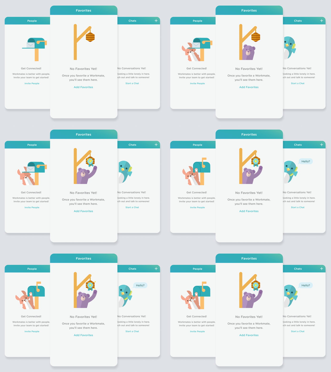
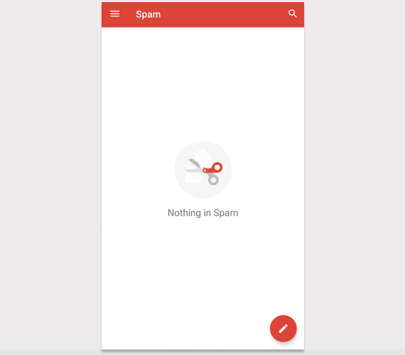
Empty lists can look like a big white screen without any messages or just an “Empty” text. But the truth is, that an empty screen is a great opportunity to engage your user! Tell them what should they do to fill that screen with content. Ask them to use your application and fill that empty screen with some content. 🙂
Loading state
Your loading screen could be just an indicator. Or maybe a “Loading…” text. Why? Isn’t that better if your user sees something interesting? Definitely yes. Let’s see the gaming industry for example. Most of the games when it’s loading, the user sees some useful — or not too useful 🙂 — tips.

Conclusion
Think as a user. You really hate when you use something and there’s nothing on the screen or just a loading indicator spins until you get stressed and finally quit. Don’t you want the application to give you something useful? I assume you want it. And your user wants it too. 🙂
What do you think?
Have some similar experience? Want to ask some questions? Share them with us via e-mail to partner@benestudio.co and we can set up a talk with our engineers.
Looking for a new job or a partner to develop your next project? Check out our open positions and our services to see what we do.
