How to Indicate Content Overflow with React Scrollfade
At bene : studio we love knowledge sharing to help the community of professionals. With 10+ years and over 100 projects behind us, we have a vast amount of experience. This is why we have launched a knowledge base on our blog with regular updates of tutorials, best practices, and open source solutions.
These materials come from our internal workshops with our team of developers and engineers.
Pardon the interruption, we have an important message!
We are looking to expand our team with talented developers. Check out our open positions and apply.
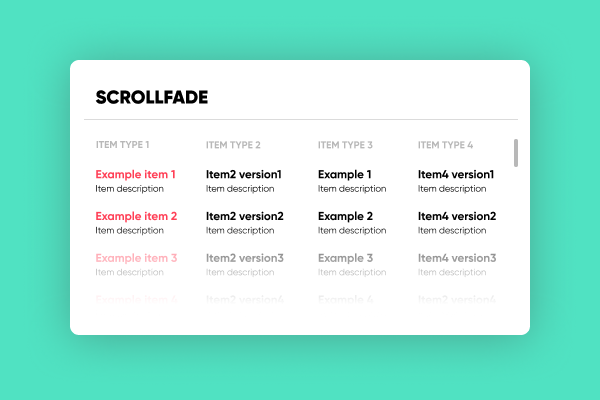
When a simple scrollbar is not enough
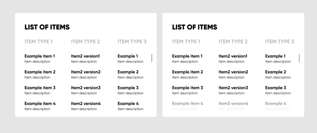
In one of our React applications we have created small widgets for displaying data for the user to interact with. This data would be most often in the form of a list, and given the small sizes of the widgets it would easily overflow. The most commonly used indication of overflow content is to simply cut the content and add a scrollbar. This usually works well when there are clear situations, such as continuous flowing text or large headings, possibly images. In the case of lists, it can often happen that the content fits right into the frame. That’s why our designers requested an additional fade for indicating runaway content.
To me this seemed like a commonly used design element, so I started searching for an existing solution. Lo and behold there was none. Or at least not for this exact problem.
Then react-scrollfade was born
A component that dynamically fades out the bottom of an HTML element based on the scrollbar’s position.
Because this design element is used all over our application, a main goal was to provide this functionality with as little configuration as possible. As you can see it needs none! Just include it in the right place.
The implementation
To see how this is accomplished let’s take a look inside.
What to fade
The component determines the element to fade by its position in the DOM tree. It applies the CSS mask and attaches a scroll event listener to its direct parent.
The color
It uses linear-gradients as CSS masks making the bottom of the element transparent. Effectively the color of the fade is determined by what is under the element.
The rest
Other attributes like the exact height of the fade and the way the fade disappears, are very opinionated.
The height is set to 56 pixels because that’s how our designer imagined it, and it works for now.
The opacity is calculated with a simple ease-in function, where x = scrollbar’s position / scrolled element height.
A caveat
The fading also fades out the scrollbar. For now, we got around it by using simple-bar to render a custom scrollbar. This is something we would like to improve in the future.
Plans for the future
As mentioned above, the component takes no configurations and is very opinionated. In the future plans are to include an interface for:
- adjustable width and height
- adjustable color
- customizable ease-in function for determining the amount of fading
- left, right, and top fade
Contribution
You can find the source code on our Github.
We invite everyone to leave feedback in the form of an issue or contribute by creating a pull request.
Did you like this? Join us!
Want to ask some questions? Share them with us via e-mail to partner@benestudio.co and we can set up a talk with our engineers.
Fancy working for the studio where you can work on international projects and write articles like this? Check out our open positions!
Looking for a partner for your next project? Check out our services page to see what we do and let’s set up a free consultation.