Themes in React and ReactNative
Pardon the interruption, we have an important message!
We are looking to expand our team with talented developers. Check out our open positions and apply.
At bene : studio we love knowledge sharing to help the community of professionals. With 10+ years and over 100 projects behind us, we have a vast amount of experience. This is why we have launched a knowledge base on our blog with regular updates of tutorials, best practices, and open source solutions.
These materials come from our internal workshops with our team of developers and engineers.
When developing a large scale app it is a good idea to build our own UI components. The styles should be factored out to be DRY.
UPDATE: Implementation with HOOKS! 🎉
Hooks are available for a while, so use them! See the very easy implementation below:
import React, { createContext } from 'react';
import { Text, TouchableHighlight } from 'react-native';

// create the context
const ThemeContext = createContext(lightTheme);

// custom hook for theme
const useTheme = () => useContext(ThemeContext);

const Button = ({ text }) => {
  const theme = useTheme();

  return (
    <TouchableHighlight>
      <Text style={{ theme.color }}>{text}</Text>
    </TouchableHighlight>
  );
}

const App = () => (
  <ThemeContext.Provider value={darkTheme}>
    <Button text="Dummy Text" />
  </ThemeContext.Provider>
);
Context
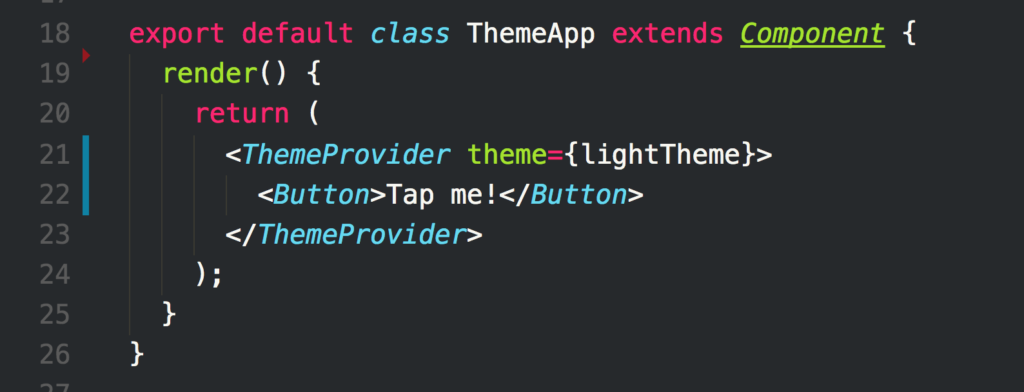
React context is a suitable tool for dependency injection. Similar to props but propagates implicitly. Let’s inject our theme.
<ThemeProvider theme={lightTheme}>
  <Button>Tap me!</Button>
</ThemeProvider>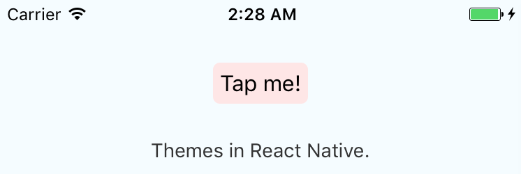
Button
1st param is props, 2nd is context.
contextTypes has to be defined in order to receive properties in context. Otherwise context will be empty.
const Button = ({ text }, { theme }) => (
  <TouchableHighlight>
    <Text style={{ theme.color }}>{text}</Text>
  </TouchableHighlight>
)
Button.contextTypes = {
  theme: PropTypes.shape({
    color: PropTypes.string
  })
}
ThemeProvider
The return value of getChildContext() will be propagated to its children down the component tree as context.
childContextTypes property is needed to defined.
class ThemeProvider extends React.Component {
getChildContext() {
return {
theme: this.props.theme
}
}
render() {
return this.props.children
}
}ThemeProvider.childContextTypes = {
theme: PropTypes.shape({
color: PropTypes.string
})
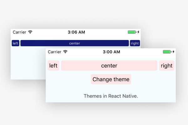
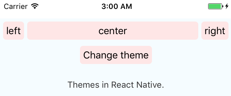
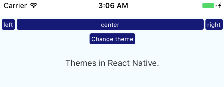
}Change Themes
Themes can be changed through props. The example below toggles two themes in the state.
Working Example
You can try out a working example both on iOS and Android after setting up development environment.
react-native run-ios
react-native run-android
https://github.com/adambene/reactnative-themeapp
Did you like this? Join us!
Want to ask some questions? Share them with us via e-mail to partner@benestudio.co and we can set up a talk with our engineers.
Fancy working for the studio where you can work on international projects and write articles like this? Check out our open positions!
Looking for a partner for your next project? Check out our services page to see what we do and let’s set up a free consultation.