UX improvements for a home-monitoring health app
As a digital product consultancy, bene : studio has always been interested in examining systems and applications and finding ways to improve them.
The team at bene : studio is not only curious about improving systems and applications but loves sharing knowledge and therefore has made the findings of some of the product audits public to support the HealthTech community, as the studio becomes more and more involved within this industry.
In this article you will read the outcomes of a Product audit we’ve delivered for Okko Health. Product audit is a core service of bene : studio. It serves as a foundation to support the product planning, design, and development services for a client.
About Okko Health

Okko Health is a developer of home-monitoring applications designed for measuring vision. The company’s software combines vision science and computer science to measure sight as precisely and reliably as physically possible, thereby enabling patients who are at high risk of eye disease to self-monitor from home and avoid the hospital.
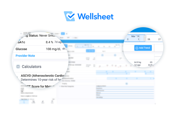
Bene : studio delivered a product audit to Okko Health, reviewing their UX design
About this audit
This audit (also known as Expert review or Design review) summarizes our impressions while checking your product. It enlists and weighs the issues found, and provides suggestions to solve them.
We love design, research and discovery, and believe that the experience-based suggestions we collected help you reach your business goals
This is not a complete product audit but hopefully gives you a hint what value an audit can provide
What you will learn
First, you can read about what is a product audit and what principles (“heuristics”) we consider during the process.
Second, we took a deeper look at the onboarding flow and the participating screens – you can read our findings and suggestions.
Third, we measured and categorized the issues by severity and the estimated resource need of a solution.
Finally, we recommend steps to take to increase the user-friendliness of your product.
What is a product audit?
It is important to learn the key characteristics of a product audit:
- It is complementary to (and not interchangeable with) a usability test
- It doesn’t consider analytics
- It can inspect various specifications of a user flow or an isolated segment of the design
- The reviewer might not be a member of the target audience
- As opposed to user testing, it can better articulate how well the application meets existing design/UX standards, best practices, and common principles
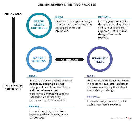
The figure below shows the role of the product audit within the design and testing process of a product:
The heuristics we use
Here are the main heuristics that we consider in the course of our reviews:
- Affordance – how clearly interface elements suggest how they should be used
- Consistency – internal (consistent usage of the interface throughout the app/website/brand) and external (consistency with industrial patterns / best practices / commonly used symbols and standards)
- Tolerance – preventing errors, helping recognition of and recovery from errors
- Accessibility – usability by all intended users
- Visibility of system status – user knows where they are, what they can do, how they can more forward, getting feedback upon events
- Match between the system and the real world – speak the user’s language, choose familiar expressions and visual elements that follow real-world conventions in the topic domain
- Simplicity & clarity – Keep the content and visual design of UI focus on the essentials. UI is clear and easy to understand.
- User control and freedom – empowering the user to freely interact with the system and provide ways back from states
- Recognition over recall – preventing users from having to guess or remember info (that can otherwise be displayed) to proceed
- Flexibility and ease of use – tailoring the system to various user groups (or experience levels) without causing cognitive burden cross-group
- Purposeful design – Making sure that UI elements are visually designed to support their function, and visual hierarchy supports users goals.
Flow analysis of onboarding in the Okko app
What you can find here
In this section we go through the Onboarding flow and examine its screens, interactions and UX, and assess how well they fulfill the heuristics mentioned in the previous section. We will highlight design decisions that are well made and should be kept for long.
We will also highlight some issues that should be addressed.
For the assessment we mainly used an iPhone 8, but involved an Android device (Samsung Galaxy A41) and an iPad (9th gen) for comparison and responsivity checks.
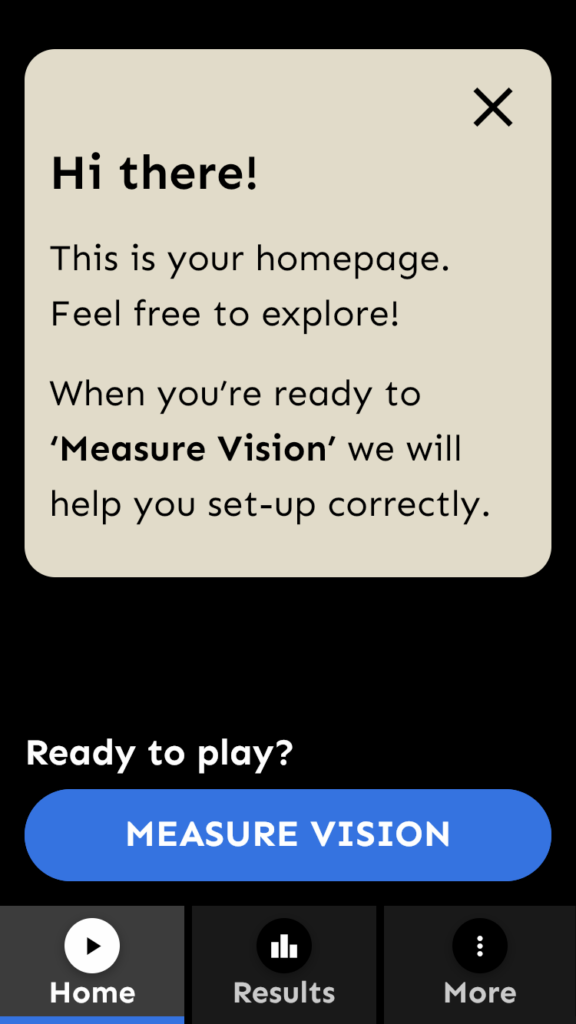
First launch
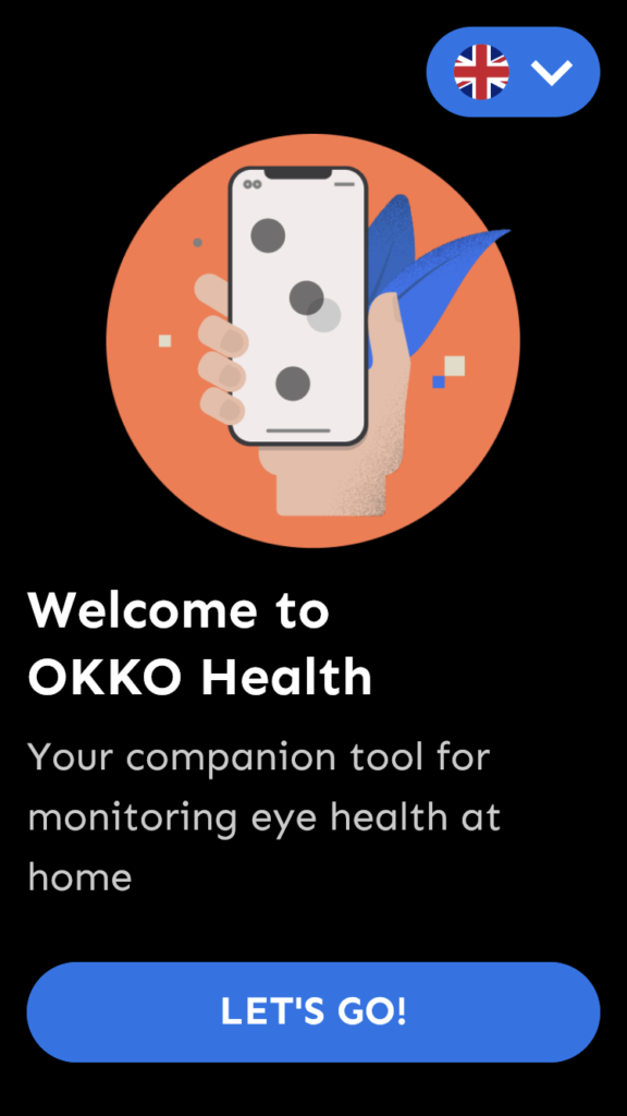
Already great:
- Simplicity & clarity: The initial screen delivers just what is needed at that moment to the user: app name, slogan/key app feature and just one Call To Action (CTA) button. Button label suggests that, as a user, I am going to be shown around, or at least guided to take the first steps.
- Accessibility: Language selector is a nice touch here, preventing the user from missing anything the app has to tell them before they get to some “settings” tab, where the language selector is usually located.
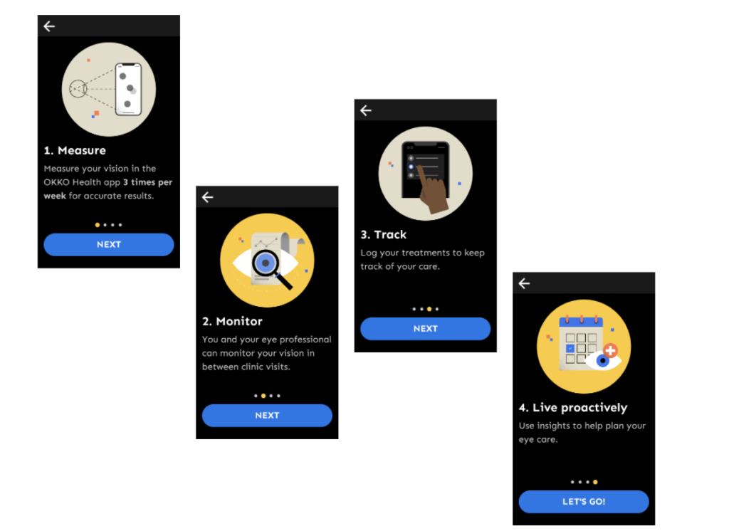
Already great:
- Simplicity & clarity: The screens neatly summarize the user’s main journey with the app and its benefits.
- Visibility of system status The dots give me a clear indication of where I am in the slideshow. 4 slides are the most you can still get away with without having a “skip all” option.
To improve:
- Match between the system and the real world Illustrations are somewhat noisy and abstract, not very helpful in describing the messages below them.
- Accessibility & Consistency & User control and freedom Reading out messages is a nice idea, but sounds and voice play automatically. What if I don’t need it? Also not everything is read out. What is the rule? Third, are those people, who need text-to-speech to understand screen content, a target audience of the app?
Initial screen
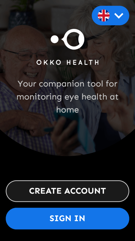
Already great:
- Simplicity & clarity: Here is where we want to emphasize that the application overall has a very clean design.
- Visibility of system status The dots gives me a clear indication where I am in the slideshow. 4 slides is the most you can still get away with without having a “skip all” option.
To improve:
- Visibility of the system status: The “Create account” button says it will be an account creation process. However, the titles of the following screens vary (and they are sometimes called “Create account”!). This might confuse the user after clicking the button whether they are still in the account creating process.
- Suggestion: either 1. rename the “Create account” button; 2. rename the “Create account” subpages to something else; 3. Display the “Create account” label continuously in the subpages’ header, close to their title; 4. Rename every subpage to “Create account”.
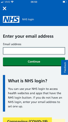
Signing up
Already great:
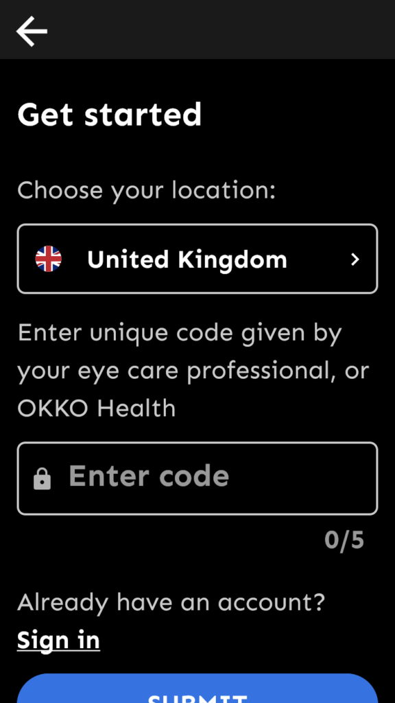
- Affordance: The chevron (arrowhead) in the location selector nicely indicates that a separate overlay will appear from which I can probably select other regions.
To improve:
- Consistency: Colon character is missing after “OKKO Health”.
- Suggestion: add the colon.
- Consistency: “Enter code” text is bigger and it is placed higher in the field than “United Kingdom”. (only on iPhone)
- Suggestion: check paddings and text sizes for the iPhone version of Okko Health.
- Simplicity & clarity Code field character counter (“0/5”) doesn’t have a value. It is commonly used where users can write messages or when the code has exactly 5 characters. Here neither is the case.
- Suggestion: delete the character counter. It makes the screen cleaner and maintains uncertainty about the max length of the code, which might prevent malicious attempts to guess the code.
To improve:
- Visibility of system status: I got here by tapping on “Create account”, so that’s what I expect to happen. The title “Get started” doesn’t match the button title, raising a little doubt in the user if they are at the right place. (Then the next screen has the expected title…)
- Suggestion: match the title with the label of the button that leads to this screen.
- Navigation: I came to this screen through “Create account”, so I already decided this is what I intend to do. “Already have an account? Sign in” is therefore confusing in this screen.
- Suggestion: delete the “Already have an account? Sign in” text
- Visibility of system status: There is no indication of how many steps there are in the account creation flow, and which step I am currently at as a user.
- Suggestion: use a progress bar or step counter, e.g. as the dotted one seen in the “First launch” section.
Already great:
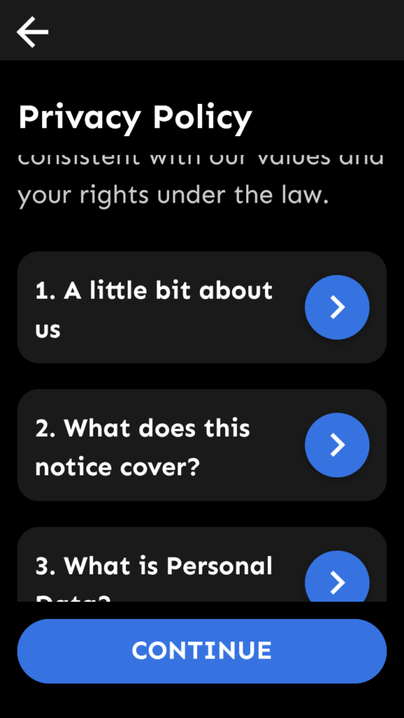
- Visibility of system status: The sticky “Continue” button is a nice way to tell the user how to move forward without them having to scroll all the way down to the bottom of the page.
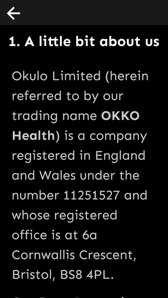
- Purposeful design & User control: and freedom It’s a very nice solution to delegate sub-sections of the Privacy Policy into openable subpages on a mobile device.
To improve:
- Consistency: Title is placed lower than in the previous screen
- Suggestion: adjust placement of the title and check all other occurrences.
To improve:
- Consistency: Font size increased when entering a sub-page.
- Suggestion: fix font sizes and check all other occurrences for better consistency.
Already great:
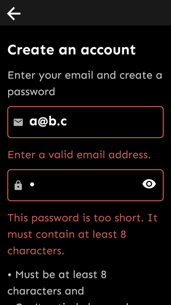
- Purposeful design & Visibility of system status: Error messages clearly stick out, showing all the errors to the user. Suggestion: When displaying errors, place the cursor in the topmost erroneous field.
To improve:
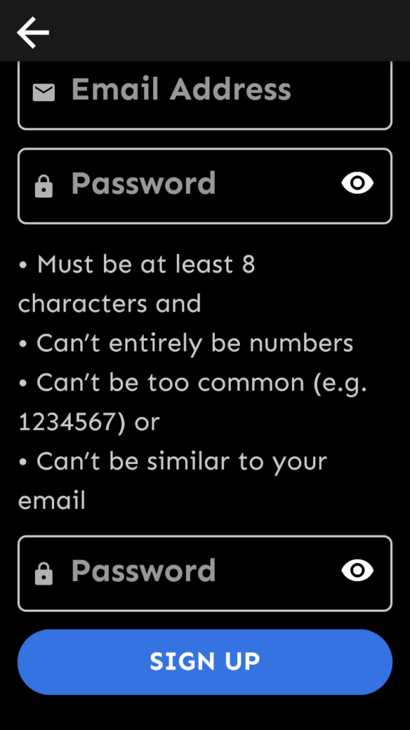
- Affordance Although some people are used to entering a new password twice, it’s not indicated anywhere that the second “Password” field needs the user to repeat the password set above.
- Suggestion: Rename the placeholder text “Password” to “Password again” or “Repeat password”. If necessary, the font can be smaller here.
- Consistency Password can’t be too common, e.g. “babababa”, but it accepts “abababab”.
- Suggestion: use common password restriction practices
To improve:
- Visibility of system status: Because of the very similar and simple design of screens, and also the lack of visual cues, it’s unclear where I am: Have I finished the account creation or still in the process? I suspect I am in a new flow, because of “Welcome”, and because there is no back button anymore, but, confusingly, screen design remained the same.
- Suggestion: Make a visual difference between the account creation flow and the Welcome screen. Celebrate a successful signup.
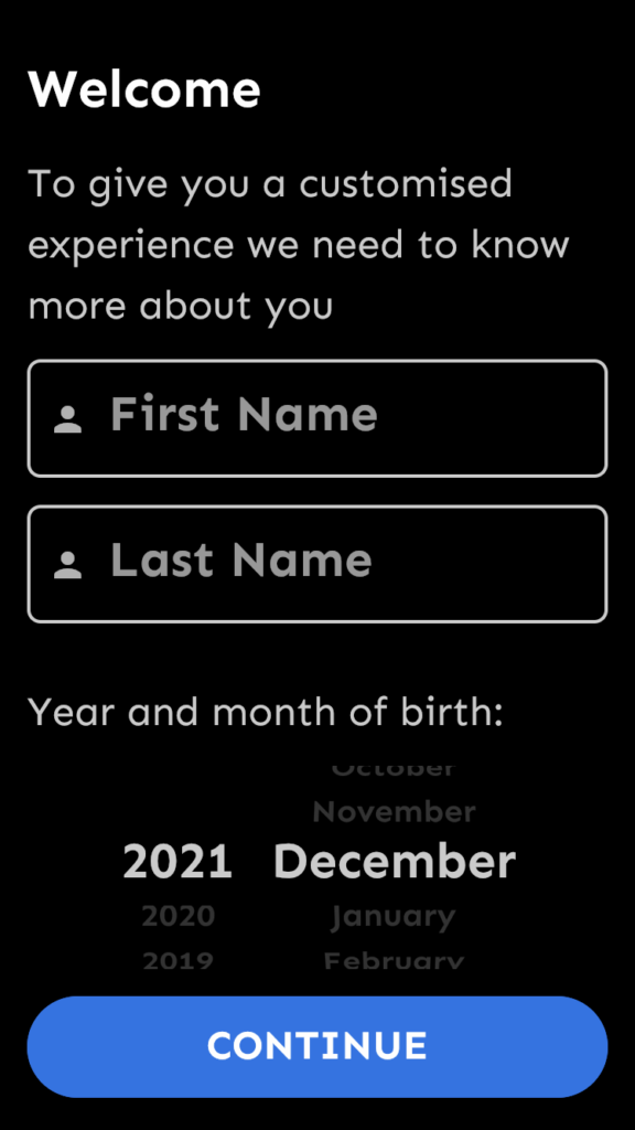
- Purposeful design: The date of birth selector is defaulted to a date that is probably far from the user’s real date of birth. Also, it accepts October, 2021.
- Suggestion: Set it to something like January 1980. Consider refined validation, e.g. minimum age.
Already great:
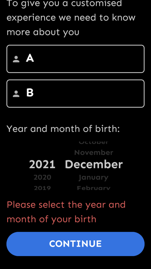
- Visibility of system status: Using popups is a good way to give feedback to the user if they fail to move forward. (as opposed to disabling the “Continue” button)
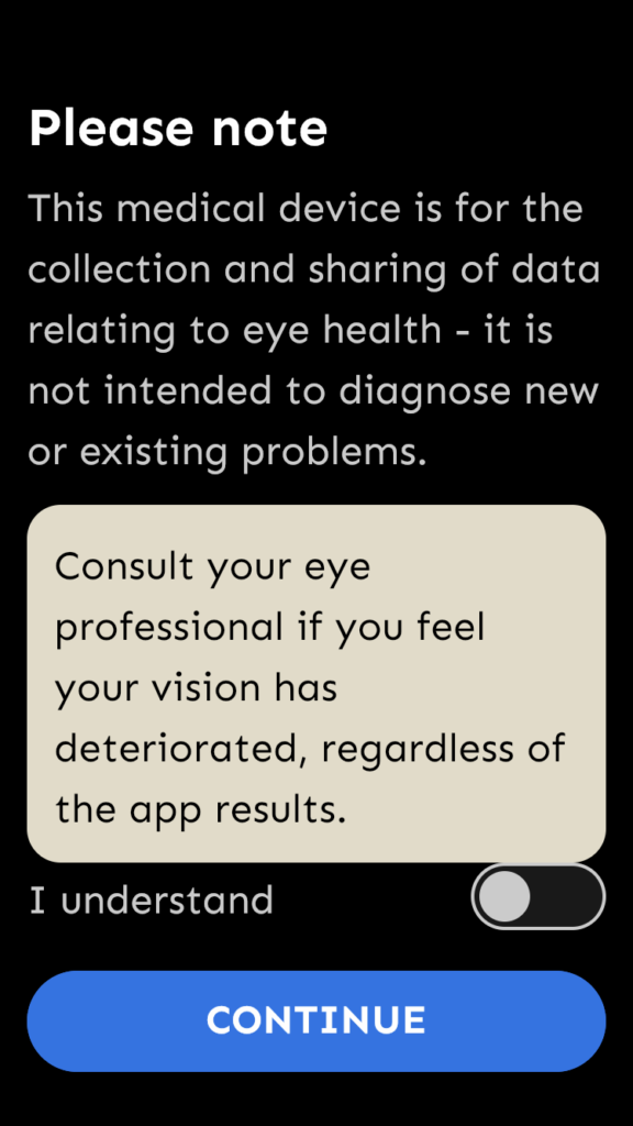
To improve:
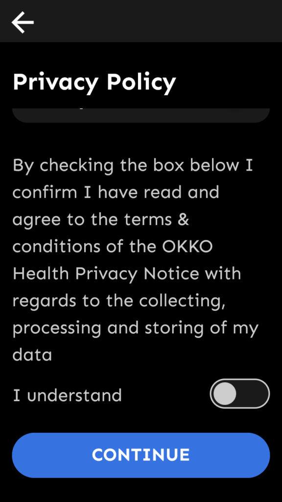
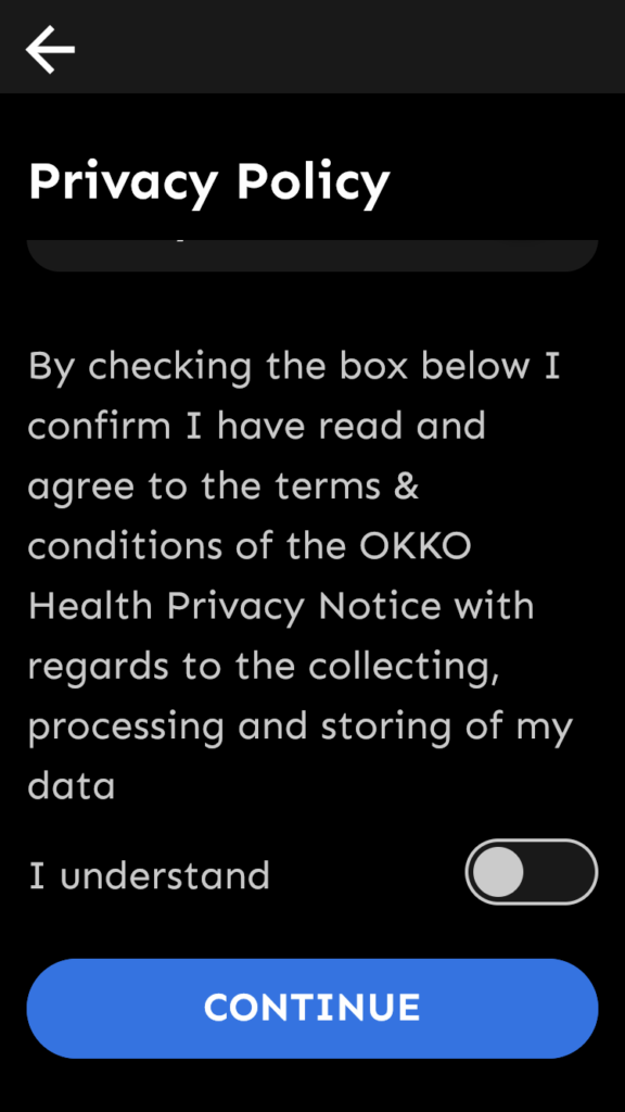
- Simplicity & clarity: Highlighted message and “I understand” switch are too close.
- Suggestion: increase space between them.
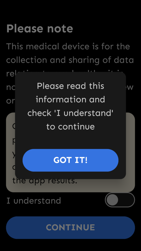
To improve:
- Visibility of system status: Because of the similar design, It’s still confusing where the user is at. Is it still the “Welcome flow”? How long will it take?
- Suggestion: make it clear visually or with words where the user is at in the system. E.g. say “Important note before you use Okko Health” in the title. Or create a non-closeable popup overlay in front of the app UI, blurring it around the popup window.
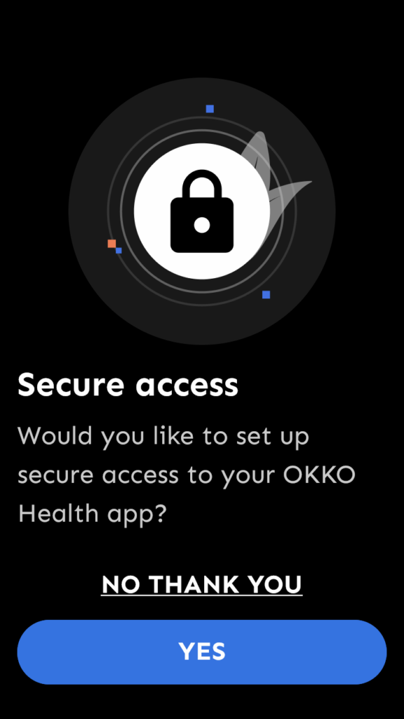
- Simplicity and clarity: The meaning of “Secure access” is not explained before decision is required.
- Suggestion: Explain.
- User control and freedom: Popups appear full-screen, with a similar design as the rest of the app, confusing the user how they ended up here.
- Suggestion: Create a different look for popups and/or make them non-full-screen.
First time in the app
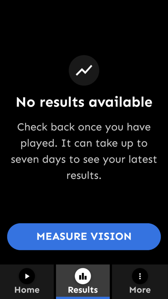
Already great:
- Visibility of system status A very convincing welcome message for newcomers to the app!
- Visibility of system status Empty states (“No results available”) with a hint how content can appear here is very useful, especially with the “Measure vision” CTA.
To improve:
- Match between the system and the real world: It’s a very strong point of Okko Health that it measures vision using games. However, so far the app didn’t tell much about it.
- Suggestion: This could be the right time to make it happen! Introduce the user with the concept, tell how “playing” and “measuring vision” are synonyms in the application. What we basically suggest here is including a few – optional – onboarding steps. It can also get emotional buy-in from the user.
Menu and menu links
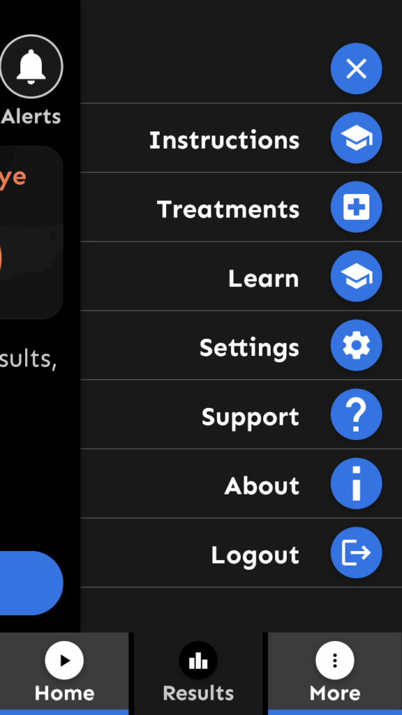
To improve:
- Affordance: Hamburger menu toggle (3 dots) usually doesn’t appear as a bottom menu item, but it can be learned quickly.
- Suggestion: no changes needed.
- Affordance & Simplicity & clarity: With the hamburger menu open, the bottom menu has 2 highlighted items at the same time.
- Suggestion: use a different highlighting for the hamburger menu toggle.
- Simplicity & clarity: Menu items should not use the same icon.
- Suggestion: change the redundant icon
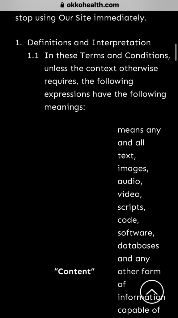
- Simplicity & clarity: Webview displays a different design and an uncomfortable reading experience.
- Suggestion: redesign the webview content to better match the design of the mobile app
Password reset
To improve:
- Consistency & Simplicity & clarity: It’s unclear why the system needs my location for password recovery. It’s also uncommon.
- Suggestion: Remove the location selector.
- Consistency: ”Email Address” is written with a bigger font and it is placed higher in the field than “United Kingdom”. (only on iPhone)
- Suggestion: check paddings and text sizes for the iPhone version of Okko Health..
Measurement and categorizing of the issues
In our research, we examine a UX issue in two typical dimensions: its impact on the user’s experience, and by the work needed to fix it. Based on the outcomes, we build a prioritized task list with our clients that deliver the most value for the dedicated budget.
Categorizing problems based on their impact on UX
When analyzing issues based on their impact on UX, we consider their occurrence and persistence – that is, how easy it is to overcome them next time. As a result, we rate them on a 3-degree scale:
Blocking (or critical) issue: prevents the user from using a functionality completely.
Serious issue: user can perform the related action(s), but with much frustration.
Minor issue: Non-critical, but the user will have a significantly better experience with the product if it is fixed.
Categorizing problems based on their estimated fixing cost
When the result of this two-step analysis is in front of us, the next step is to go with a prioritized fixing list (a roadmap of when to fix what), as stated above. The first step will obviously be eliminating those critical issues with a quick and easy solution.
Beyond this, the roadmap is discussed between our client and us, considering time, budget, and usually one more dimension: how well the issue affect the business. (e.g. even if a photo uploading bug is just a minor functionality in the app, if many people mention it in the app store reviews, resulting low grades, it quickly becomes a severe issue for the business)
When rating issues by the fixing cost, we estimate the complexity of the solution based on our prior experience. We place the issues on a similar scale as above:
Low complexity: it is easy and fast to solve the issue, as the issue is also simple or there is an off-the-shelf, commonly known fix for it.
Medium complexity: the issue can be fixed with redesigning, but doesn’t really affect other parts of the product.
High complexity: Fixing the issue needs rethinking entire function groups, flows or the information and software architecture.
Categorizing issues found in the Okko Health app
We display our analysis using a 2D scatter plot. The complexity of fixing the issues was based on our prior knowledge. The real complexity depends on the platform’s technology and the chosen implementation method (if more than one are available).
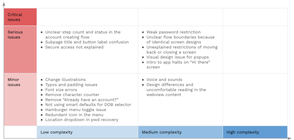
Summary of the analysis
The diagram shows there are no critical issues found in the flow we analyzed. That is good. However, some issues are categorized as serious, meaning that the user can make their way to their goal, but they may experience frustration. This frustration stems from the navigation issues and some missing or misleading information on the screens.
We can offer Bene Studio’s strong experience in design, development, and testing to fix these problems. Besides our user-centric approach, we pay high attention to your needs and capabilities as a business owner. We set and execute a suitable roadmap together with you, to ensure the highest business value.
We would love to look at your digital product!
We help our clients develop their products, starting with a product audit. With the experience of more than 100 projects, we look at the values of a product and key areas to improve within the application, software, UX, design, or user flow.
With our regular design consultation you’ll get even more to improve your design:
- You receive a thorough audit of your current product, including all flows and several platforms
- You receive a thorough audit of your current product, including all flows and several platforms
- We perform checks on your proposed feature updates to make sure it fits all requirements
- We help you find the best solutions for your actual product design challenges
- You get unlimited access to our experience with 100+ projects
- And if you’re overwhelmed, we can support you with the execution as well