Prioritizing UX improvements by severity and cost
Product audit is a core service of bene : studio. It serves as a foundation to support the product planning, design, and development services for a client. This time we are looking HealthTech app by Span.
As a digital product consultancy, bene : studio has always been interested in examining systems and applications and finding ways to improve them.
The team at bene : studio is not only curious about improving systems and applications but loves sharing knowledge and therefore has made the findings of some of the product audits public to support the HealthTech community, as the studio becomes more and more involved within this industry.
Introduction to our client: Span

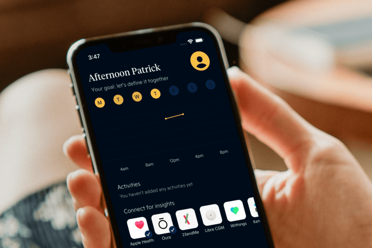
Span is a San Francisco-based digital care provider that enables people to improve their quality of life with support from the best nutritional and behavioral health professionals in the context of their lifestyle.
What you will read about
- First, we took a look at an important user flow and the participating screens – you can read our findings and suggestions
- Second, we measured and categorized the issues by severity and the estimated resource need of a solution
- Finally, we recommend steps to take to increase the usability, usefulness and business value of your product
Importance of prioritization
When fixing UX problems we examine two typical dimensions: impact and cost of repair. Although in most cases it is more expensive to go back and fix issues, rather than launching the ideal version, the problems will result in waste, meaning lost customers and additional costs.
It is imperative to examine these two aspects so that we can decide on priorites and put them into the task list or backlog. Without this approach we would not be able to see the real size of the problem.
The measured issues then can be plotted on a chart for a nice visualization, as you will see it in the end.
User flow in the app
This audit summarizes our impressions while checking the product. It enlists and weighs the issues found, and provides suggestions to solve them.
During this audit we tested one user flow: the one which adds the user to the waiting list. We perform testing by running through a flow multiple times, enabling us to check the same screens with different inputs, exclude issues that we falsely identified an issue the first time, and let us learn the app better.
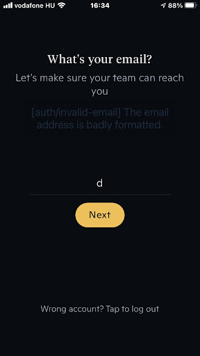
Step 1
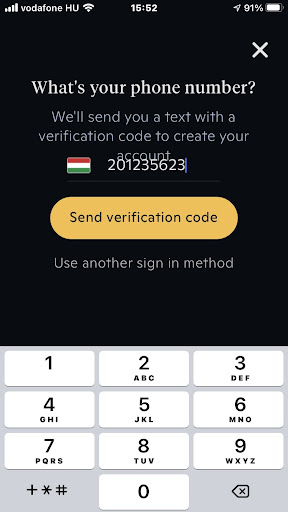
- In keypad mode: phone number overlaps the instructional text (tested on iOS).
Suggestion: On most devices, the entire content can fit the screen, even with the keypad visible. For older devices with small resolution, scrolling down the screen does the trick. - Flag is nice that it is detected, but it doesn’t tell if I still need to enter the country code or not.
Suggestion: Display the country code next to the flag in written format, e.g: (+36) - Use another sign in method: User doesn’t assume that they can sign in anywhere. If this is a registration flow, why do I read this?
Suggestion: Clarify the flow and only communicate those actions that fit into that flow. - The upper closing X is confusing. This is a part of a flow, and thus should not act like a closeable popup.
Suggestion: Clarify the flow steps, which should be a screen and which should be a popup.
Step 2
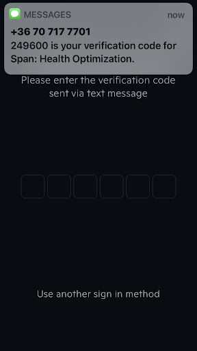
- Low contrast between the code fields and the background.
Suggestion: Increase contrast. - I have to manually tap onto the code fields to enter the code.
Suggestion: Focus can immediately go to the field. It doesn’t have to display a cursor, of course, but displaying a keyboard would clearly show that I can enter the code right off.
Step 3
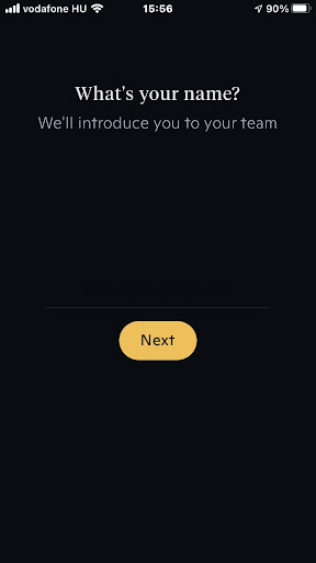
- As a user, I need more information here. The app talks about a team, but it doesn’t tell who they are, and what introduction means. Even if I am aware of the service, it creates confusion.
Suggestion: Explain what is going to happen.
Step 4
- Asking sensitive without further explanation. I don’t yet know what will happen and how my address is taking part in this. I sort of understand why it is necessary, but I’d want to know more to feel comfortable. Who is my team? Why and how often will they contact me? Why do they need my e-mail address that cannot be done through the app?
Suggestion: tell more about what the service is that is now being created for me, and how my email address will be used in it. - “Wrong account? Tap to log out” – If this is a registration process (as it looked like one until now), how can I be already logged in?
Suggestion: Clarify the flow and only communicate those actions that fit into that flow. - Low contrast between the code fields and the background.
Suggestion: Increase contrast.
Step 5
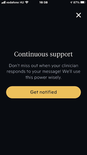
- Screen doesn’t tell what exactly will happen if I press “Get notified”, causing confusion.
Suggestion: Explain it. - Pressing the top-right “X” takes to a blank screen.
Suggestion: It should take me to the page I opened it from. - This popup can be invoked by pressing a CTA-level button (“Get started”). It is an uncommon pattern, as a CTA takes the user further in the flow, while a popup assumes that the user gets back to the same screen. The Continuous support indeed is not the main goal of this flow.
Suggestion: If this function is not the main conversion, but just an option available to the user, it should be treated as such: a link on a page should open this popup, and closing it takes me back.
Step 6
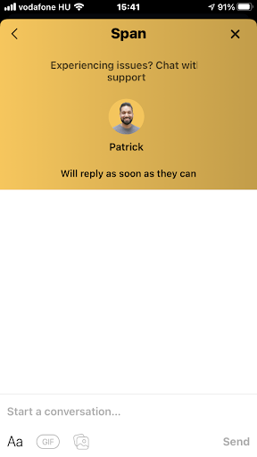
- As a user, I need more information here. The app talks about a team, but it doesn’t tell who they are, and what The issue reporting popup has a surprising “back” button, which is quite unusual for a popup. I don’t expect to go back anywhere but to the screen where the popup was triggered. But for this purpose I already have the top-right X button. When I click the back button, it takes me to a redundant page.
Suggestion: remove the back button.
Measurement: categorizing the problems found
In our research we examine a UX issue in two typical dimensions: by its impact on the user’s experience, and by the work needed to fix it. Based on the outcomes, we build a prioritized task list with our clients that delivers the most value for the dedicated budget.
Based on their impact on UX:
When analyzing issues based on their impact on UX, we consider their occurrence and persistence – that is, how easy it is to overcome them next time -, too. As a result, we rate them on a 3-degree scale:
Blocking (or critical) issue: prevents the user from using a functionality completely.
Serious issue: user can perform the related action(s), but with much frustration.
Minor issue: Non-critical, but the user will have a significantly better experience with the product if it is fixed.
Based on their estimated cost of repair:
When rating issues by the fixing cost, we in reality estimate the complexity of the solution based on our prior experience. We place the issues on a similar scale as above:
Low complexity: it is easy and fast to solve the issue, as the issue is also simple or there is an off-the-shelf, commonly known fix for it.
Medium complexity: the issue can be fixed with redesigning, but doesn’t really affect other parts of the product.
High complexity: Fixing the issue needs rethinking entire function groups, flows or the info/sw architecture.
When the result of this two-step analysis is in front of us, the next step is to go with a prioritized fixing list (a roadmap of when to fix what), as stated above.
The first step will obviously be to eliminate those critical issues that have a quick and easy solution.
Beyond this, the roadmap is discussed between our client and us, considering time, budget, and usually one more dimension: how well the issue affects the business. (e.g. even if a photo uploading bug is just a minor functionality in the app, if many people mention it in the app store reviews, resulting in low grades, it quickly becomes a severe issue for the business)
The problems categorized
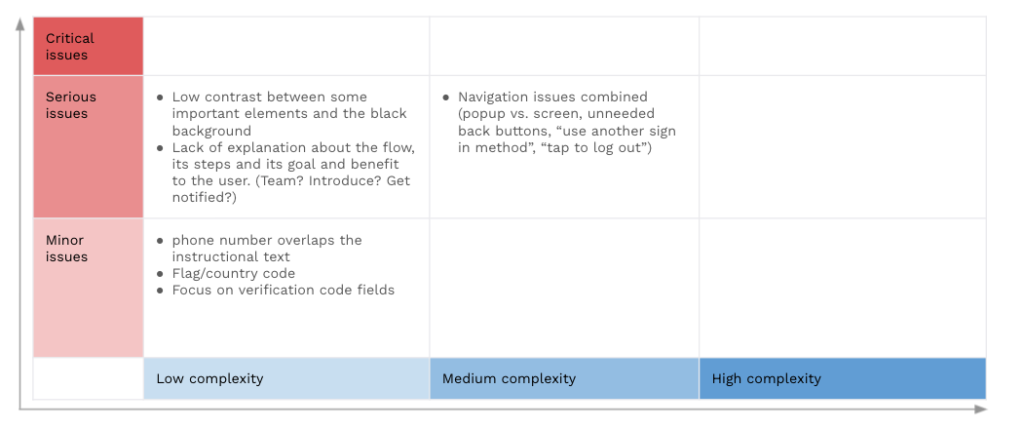
Summary of the analysis
The diagram shows there are no critical issues found in the flow we analyzed. That is good. However, there are some issues categorized as serious, meaning that the user can make their way to their goal, but they may experience frustration. This frustration stems from the navigation issues, as well as some missing or misleading information on the screens.
Solving these issues are either easy or can be done with some restructuring and UX writing.
About product audits
Bene : studio helps clients develop their product strategy starting with a product audit. With the experience of more than 100 projects bene : studio lists the values of a product and key areas to improve within the application, software, UX, design, or user flow.
The audit is followed by planning where the client receives a detailed document on how the improvements can be implemented as a part of the digital product strategy.
If your startup or enterprise is interested in product audit or product planning book a free consultation with us.
- We help you find the best solutions for your challenges
- We share our experience with 100+ projects
- We can support you with the execution as well