Improve user orientation with design
Product audit is a core service of bene : studio. It serves as a foundation to support the product planning, design, and development services for a client. This time we are looking at a German HealthTech app by Hayv.
As a digital product consultancy, bene : studio has always been interested in examining systems and applications and finding ways to improve them.
The team at bene : studio is not only curious about improving systems and applications but loves sharing knowledge and therefore has made the findings of some of the product audits public to support the HealthTech community, as the studio becomes more and more involved within this industry.
Introduction to Hayv

Hayv, founded in 2021 in Karlsruhe, Germany, builds data-driven technology to make neurocentric training more accessible to a wide audience in order to improve long-term performance and resilience in physical movement. Neurocentric training is the key to solve these movement limitations, and HAYV has a mission to democratize this treatment by providing options to automatically build your individual neurocentric toolkit.
Goals of this Audit
We love design, research, and discovering new applications so we created suggestions and ideas based on our expertise to help make the Hayv app even better.
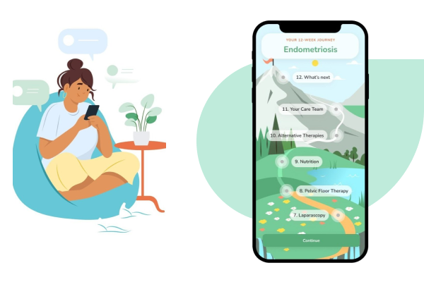
Hayv is an app that aims to relieve pain through exercises and neuro training. To achieve this, it proposes a diagnostic questionnaire to identify the specific pain, then provides the user with an exercise plan, as well as videos and illustrations to help.
What you will read about
- Onboarding and hierarchy between screens
- Menu items visibility
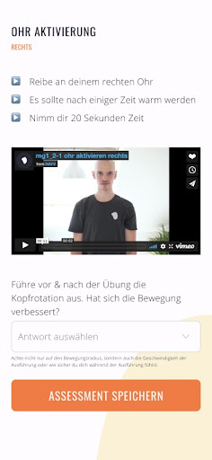
Onboarding
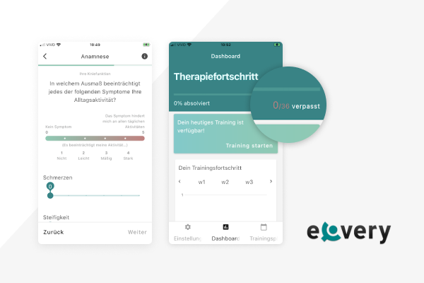
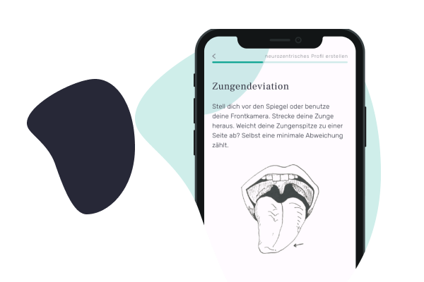
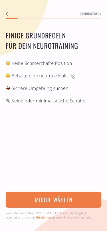
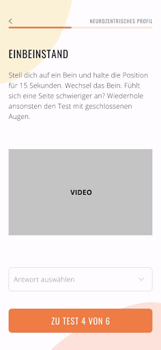
The onboarding process of an app is the very first chance to make a good impression with the user and to set the experience for the usage of the app. In Hayv’s case, it’s also when the user performs a series of tests that will trigger a specific set of exercises, based on the user’s answers.
This process should be easy and direct, so the user doesn’t get scared away. Since the user has just opened the app for the first time, they’re still not very invested in the app, and it’s easier to just give up if there’s any inconvenience or obstacle. The last statistic says that 20-30% of users abandon apps after only one usage.
Onboarding Questionnaire
Hayv’s onboarding experience is very easy to follow: well-defined steps, direct language, and a good balance between information and white spaces, so the text can breathe.
Hierarchy between Screens
One aspect that could be improved, although it’s very well designed, the onboarding screens don’t have a very strong visual identity. In fact, every screen of the app is very similar to each other, with the same font weights and sizes, backgrounds, and visual distribution, which can make the user feel a little lost while navigating them.
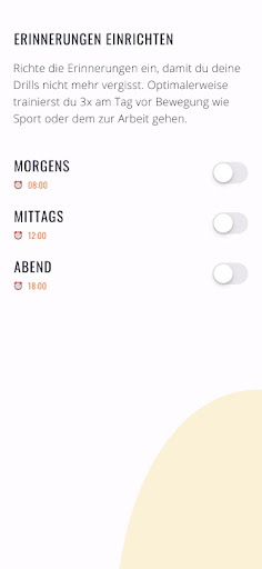
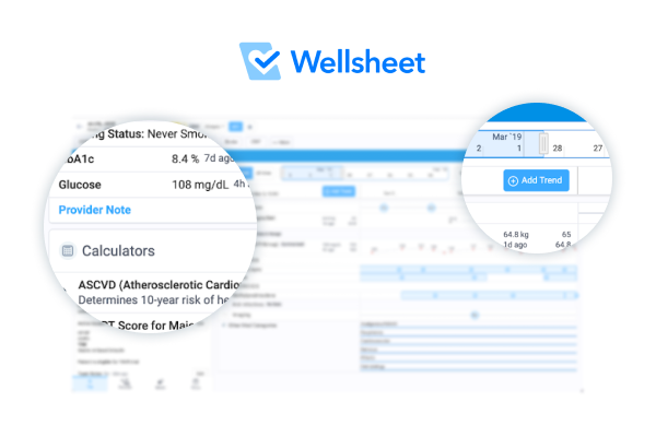
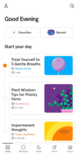
To combat this, usually, the main screens of the app have a distinct visual identity and feel that is different from the auxiliary screens, like onboarding screens or menus. This helps to give rhythm and a sense of place inside the app, so the user recognizes when they’re going to a new area, that has different functionalities. Here’s how Headspace does it.
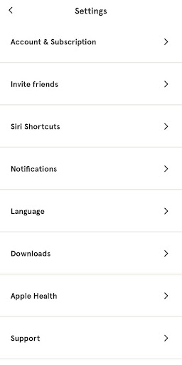
Menu Items
Menus are one of the most important tools we have to show different options to the user without filling the screen with information. We want the menu to be clearly labeled, and that the items inside of it are easily accessible. This way, the user has an easier time finding what they are looking for.
There are many kinds of menus, that can fit different situations, and choosing which one is the best can be tricky. We think that with a couple of adjustments, Hayv’s menu could be more efficient and elegant.
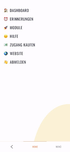
Hayv uses a bottom navigation bar, with three options: a Back arrow, Home and Menu. Inside the menu, there are different options, with varying importance and functionality. We would suggest an icon-only bottom navigation bar, with the most used navigational options: a home/dashboard icon in the place of the HOME text, and icons like Module, Reminders, and Help. The rest of the options could be inside the menu, represented by a cog icon on the bottom bar, and the back icon could be on the top left corner.
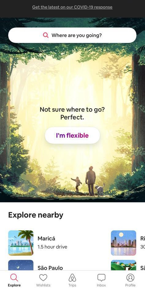
Having an icon-only bar, instead of a mixed one, makes the navigation cleaner and more consistent. In the example below, Airbnb uses labels with the icons, which can also be useful to identify the actions. But the idea is: if you want to go to another part of the app, you shouldn’t have to need to open a menu and then find what you are looking for in the middle of other options. We can save the menu for less-used links.
Overall we have seen a great, well-designed app from Hayv that has an easy-to-follow onboarding process but we could see some areas for improvement using industry best practices using visual hierarchy and a streamlined menu.
About Product Audits
bene : studio helps clients develop their product strategy starting with a product audit. With the experience of more than 100 projects bene : studio lists the values of a product and key areas to improve within the application, software, UX, design, or user flow.
The audit is followed by planning where the client receives a detailed document on how the improvements can be implemented as a part of the digital product strategy.
If your startup or enterprise is interested in product audit or product planning book a free consultation with us.
- We help you find the best solutions for your challenges
- We share our experience with 100+ projects
- We can support you with the execution as well