Upgrading the UBERDOC application
A HealthTech product audit for UBERDOC
Product audit is a core service of bene : studio. It serves as the foundation to support the product planning, design, and development services.
As a digital product consultancy, bene : studio has always been interested in examining systems and applications and finding ways to improve them.
The team at bene : studio is not only curious about improving systems and applications but loves sharing knowledge and therefore have made the findings of some of the product audits public to support the Telehealth community as the studio becomes more and more involved within this industry.
This document focuses on UBERDOC patient to specialist telemedicine web app that plays an important role in current digital transformation in healthcare.
Main values of the UBERDOC application
The main focus of the application is to connect doctors with patients on an online, self-paid, and transparent platform. The application aims to be the cutting-edge, technological alternative to the insurance-based healthcare system in the US.
UBERDOC’s mission statement is: “Patient choice is the cornerstone of our mission because it strengthens the doctor-patient relationship.”
The focus on patient choice can be yet again seen in this interview with UBERDOC founder, Dr. Paula Muto, “In a sense, we are creating a whole new healthcare driven by the only stakeholders that matter.”
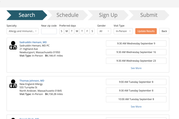
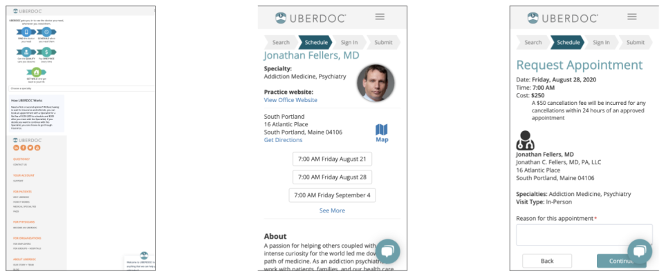
The master flow of the product matched the focus laid out in the mission statement and the above quote. The user starts at the landing page, where through a short registration form they are able to enter their ZIP code and select a speciality (for example Cardiology), and after pressing ‘Go’ has already arrived at the list of available doctors.
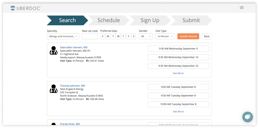
The image above showcases a progress bar, a detailed filter, and a list of suggested doctors, based on the user’s location and the selected speciality. Users can choose the preferred days of the visit, the gender of the doctor to be visited, and the visit type. The visit type can either be an in-person or telemedicine visit, a notable feature, especially during the COVID-19 pandemic.
After selecting the preferred doctor and the date and time, the interface navigates the user to the doctor’s page, where they can finish the process and book an appointment.
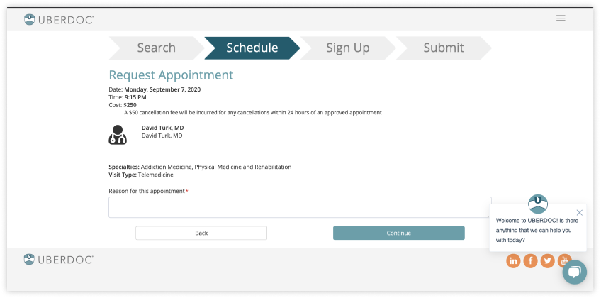
In the ‘Reason for this appointment box’, the user should best describe their symptoms or reason why they are making the appointment booking to facilitate easy communication between departments. The cost of the appointment is also clearly displayed. A game-changing feature compared to the hidden costs of insurance-based or offline private healthcare visits. It can be likened to Uber, a game-changer in the taxi industry due to both being financially transparent.
The above paragraphs highlighted noteworthy features and the master flow of the platform. The following paragraphs will take a look at areas of improvement and suggestions around the user experience and user interface.
Landing page emphasis
Currently, the registration form can be reached in three steps: 1. Open the website. 2. Click on ‘Sign In’ (which needs to be noted as possibly misleading to the user) 3. Click on ‘Create an Account’.
With the current solution, the UBERDOC landing page focuses on leading the user to use the application. However, there is a point during the application flow, where the user must register or login to finish the process, as shown by the progress bar in the above image.
This requirement to register or login breaks the master flow, being especially disruptive when a user tries the product for the first time. The first impression of a user is critically important for digital products. With this being said, the bene : studio team suggests that the same amount of emphasis is placed on the registration opportunity and doctor search.
The top digital products that bene : studio team have investigated share common best practices regarding patterns, highlighted features, and landing page arrangement.
In line with the findings that users scan their screens in a “Z” shape and therefore initially focus on the top-left area of a website, it is suggested to put the most important call-to-actions and the product’s message on the top left hand side of the screen.
Intuitive & straightforward onboarding form
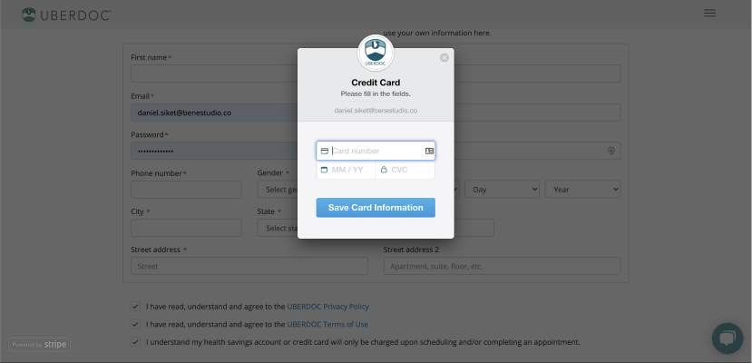
Taking into account that most users don’t like forms and have a “necessary bad thing” feeling about them, forms are still essential in registering users to a database. Therefore creating a more fun-to-use form is needed.
Reducing the error factors as much as possible is the most important during form creation. This is achieved using labels and help texts for input fields. Forms should also be clear in communicating with the user, for example, immediate error reporting with emphasis on the cause of the error, success signs, and so forth. With the current form, users can proceed to the next stage of the form filling process with errors made regarding their personal information. Users can also fill in the payment details and click to “Save card information” with no error reporting. The platform allows users to walk through the form filling process and if a user has made an error, it drops them back to the beginning of the process. This can occur several times as users do not get guided as to the proper format of the input text.
Mobile-first
Users can often find themselves in a situation where they have to perform a task on a mobile device. That’s why the mobile version is sometimes more important than the desktop one. However, it is important to note that bene : studio does not own any measured data about UBERDOC’s usage regarding the devices. While reviewing the platform on mobile, the UI solutions (such as the progress bar, doctor cards, etc.) which were already problematic on desktop, became more shattered and harder to scan.
Despite the hassle of continuous scrolling, the focus on mobile is key as it is a more comfortable means of managing a user’s online life via the use of their smartphone.
By designing a user interface with mobile-first methodology, starting from the wireframing stage, most of the responsiveness-related issues can be noted before the product development process even reaches the coding phase.
Highlighted filter & personalized list view
It can be noted that some doctors on the list have an avatar image, but in many cases, they do not. Therefore it is suggested to highlight this opportunity to the doctors in order to let the patient see the person behind (or next to) the data, in order to create a more personalized approach. On the other hand, it is understood that prejudice could arise from connecting a face (similarly to age or gender) to a professional profile. However, the team’s opinion is that it would be worth an investigation to uncover the user’s needs regarding the avatars.
Another section that can be improved is the illustration of the workflow on the logged in homepage. The workflow illustration is drawing more attention than the category selection dropdown menu. This hinders users from being able to book an appointment easily, which is of most importance. Removing unnecessary duplicate steps in the process would also be beneficial to the user.
Conclusion
Overall, UBERDOC is a brilliant telemedicine product, focusing on possibly the most important and relevant solution to the question of healthcare in these uncertain times due to the pandemic. Especially when Telehealth products and services are becoming more essential and widely used.
However, just like every other digital product, there is always room for improvement.
The bene : studio product audit highlighted a few areas that could be enhanced and suggestions on how they can be improved. Once again it needs to be stated that bene : studio does not own any measurement figures, usability test results, formal data, and business information to validate any change requests and suggestions on UBERDOC. The product audit intended to review the product using a fresh viewpoint of a first time user and aimed at providing a few easy to implement solutions.
You can find more information on UBERDOC in the Healthtech Networking Club member directory.
About product audit by bene : studio
Product audit by bene : studio helps clients develop their product strategy. With the experience of more than 100 projects bene : studio lists the values of a product and key areas to improve within the application, software, UX, design or user flow.
The audit is followed by planning where the client receives a detailed document on how the improvements can be implemented as a part of the digital product strategy.
If your startup or enterprise is interested in product audit or product strategy book a consultation with us.
.